

— Previous article
Benny Sweater- where to find?
Next article —
Official /r/nba Power Rankings #11 (3.25.2024) - Spring is here
You May Also Like
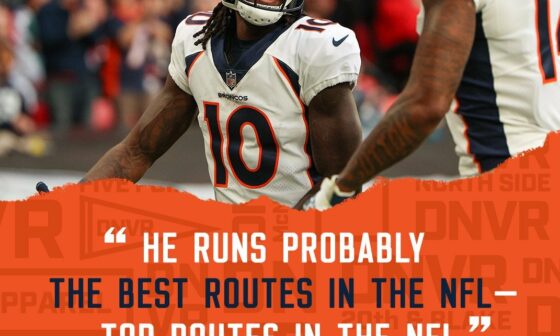
He’s right, Jerry is top 5 in route running.
He’s right, Jerry is top 5 in route running.

Our QB is DangeRUSS
Love Russ Just having a hang w my buddy Russ pic.twitter.com/AUeYHJSudY — PFT Commenter (@PFTCommenter) September 27, 2022

Let’s Go Broncos
Let’s Go Broncos
31 comments
Oh god those mountain sleeves are real.
The stupid beer can mountain sleeves it is then.
You can roll them up and smoke em!!!!
They better have elements of good uniform design, greg 😤
We’re all gonna hate the unis when the come out but I guarantee that by week 6 we’ll all be like “These are actually not too bad” and by next year we’ll be like “I really like these”.
LOL, the Mod who always shits on differing opinions looks like they were wrong on the post showing the draft orders hinted at the new uniforms. Love seeing that smug mod be wrong.
God damnit.
Oh god
Why the fucking mountains
They are gonna smell like a combination of IPAs, weed, and Greeley
Fuck
Oh fuck the leaks are right LOL
Yikes. The Walmarts aren’t exactly known for the quality or aesthetics of their merchandise so I’ll be surprised if they end up decent. Probably going to be some bland corporate shit designed by a committee with giant ass logos that make it “pop”.
[This post](https://old.reddit.com/r/DenverBroncos/comments/18i01mp/tried_a_uniform_redesign_for_those_of_us_who_want/) shows that the mountain idea can be done really well, imo
[These ones aren’t the worst](https://x.com/fashion_nfl/status/1771351359146901989?s=20)
I’m very intrigued to see them. They could be cool or a trainwreck. Very little room in between
Here come shitty mountains and 5280 plastered somewhere!
Worst fear: were dropping orange for yellow to mirror the Co flag….and are going to look exactly like the Ramgers.
If it’s the mountain sleeves or the dumb 5,280 every shitty fan mock up thinks is deep and creative I’m going to be very upset.
Pothole polka dots: confirmed.
Hopefully they weren’t designed by the same people that made the Rockies City Connect uniforms.
An Illegal Pete’s themed uniform?
He better be talking about South Park!/s
These are going to suck aren’t they?
Late March Broncos fan : Doomer crying and whining about everything
Late April Broncos fan: Snorting lines of hopium with Bo Nix in new uni as phone background
This is what we get when we let Walmart design uniforms.
It’s not that the mountain motif can’t look good as a football uniform. To me, the bummer is that mountains and Colorado have never been a part of the Broncos image. Nuggets, Rockies, Avalanche, yes. Broncos are unique in that they are just the Broncos. Kinda put them above the other teams. They no longer are the crown jewel of Denver sports, so might as well look like the rest of them. Wouldn’t mind it as an alternate but not the main set
Overall I think needing to show mountains in everything is kinda goofy, but at the same time have seen some mocks of the mountain on the side and while it’s not awesome, it’s passable enough to be forgotten about in time. Plus I’ll take any sleeve detail over the white helmet, which gods be praised is only going to be an alternate.
Trust me, as someone who was around for the ’96-’97 reveal, you can get used to a lot. If/when they start to win in them, they will end up beloved.
https://preview.redd.it/b90u63838jqc1.jpeg?width=1200&format=pjpg&auto=webp&s=b48790301862a71a70f298df13d4dee20aaf01c4
These are going to be the most boring uniforms aren’t they
Hopefully the Mountain Sleeves look better irl, then they do on Paper.
Different shade of blue or I riot.
Blucifer on the helmets confirmed
Subaru logo confirmed