Are the Blue Jerseys more blue than they were before?
March 26, 2024
Was there a uniform redesign or tweak that went under the radar?
Watching 2019 Lions videos for some dumb reason and they just seem more dull than they did in 2023.
This is peak offseason posting, i know.
23 comments
So something I found out, Honolulu Blue is just an idea. The color is whatever the team says it is and has changed many times over the course of the years.
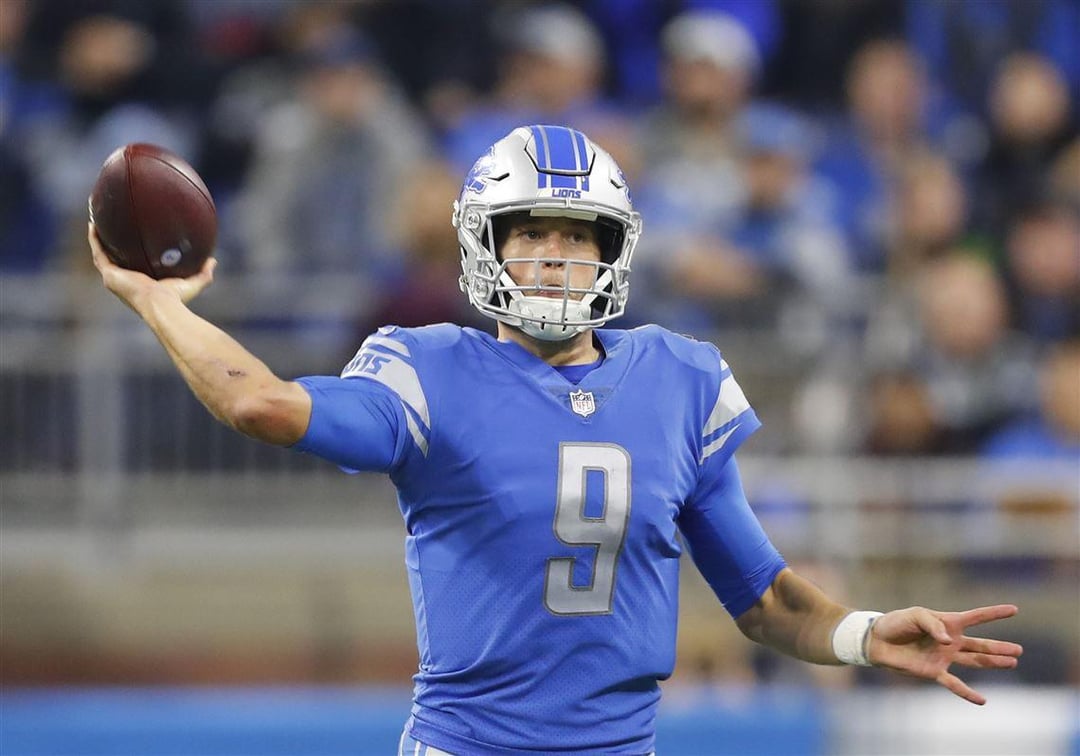
Idk about you but my eyes widen every time I see my beautiful Jared Goff. It makes them let in more light and things may appear brighter.
They are the same color jersey, but each photo has different color grading.
The blue got a bit darker and a tad more red added. I have a Barry Sanders jersey from the 90s and a Goff jersey from last year. The 90’s were definitely brighter and lighter.
The color seems to always change a bit when they go with a new design. They’re all slightly different
I don’t think they changed since 2019, though
Why, in the name of Megatron, would you use THAT picture?
Bluer, and winnier
Not bluer, but definitely Honoluluer.
I love the current blue. It definitely has more pop than previous seasons. The differences in these pictures is the type of lighting and the color grading.
You can see differences in the blue home and outdoor away just this past season because Ford Field’s lighting is artificial and a different temperature of kelvin.
Goffs jersey certainly looks greener. Seems slightly darker as well.
When it comes to color the light source is very important. Older lights provide more red energy than LEDs. So that could be the cause.
The settings on the cameras could also impact how we perceive the color.
It gets bluer with KoolAid
Picture 1 looks like a Polk High uniform.
I feel like it’s a slightly different shade every year
Quit playing games with my heart…my heart..babyeeee
Gotta appeal to the Bluey crowd somehow.
Is gum getting mintier lately?
The new ones look so good. Blueberries are the way.
It’s got something to do with cameras and screens and how the color translates from reality to a screen, it’s not my wheelhouse so I can’t explain.
While at a game, look at the players on the field in front of you and then look up at the big screen— two entirely different blues, similar differences to the photos you’ve posted.
Those two pictures have different color intensities or chroma. Making one look bluer. Not necessarily the jersey.
That’s the biggest color change since they went from black and white to color sometime in the 60s.
Fun Fact: under Nike, Honolulu blue is actually their color “Team Blue”.
The blue used today is closer to the 90s version of the blue which went away in favor of the Reebok (then known as RBK) color which was much darker.
Since Nike has been the supplier, the color has been the same. Your photos have 2 different color grades with Goff’s photo being closer to reality
i like the newer blue more. but i feel like it is more alike the 2008ish blue? was late stafford a less deep blue?
Honestly I like the newer blue better. Feels more vibrant.

23 comments
So something I found out, Honolulu Blue is just an idea. The color is whatever the team says it is and has changed many times over the course of the years.
Idk about you but my eyes widen every time I see my beautiful Jared Goff. It makes them let in more light and things may appear brighter.
They are the same color jersey, but each photo has different color grading.
The blue got a bit darker and a tad more red added. I have a Barry Sanders jersey from the 90s and a Goff jersey from last year. The 90’s were definitely brighter and lighter.
The color seems to always change a bit when they go with a new design. They’re all slightly different
I don’t think they changed since 2019, though
Why, in the name of Megatron, would you use THAT picture?
Bluer, and winnier
Not bluer, but definitely Honoluluer.
I love the current blue. It definitely has more pop than previous seasons. The differences in these pictures is the type of lighting and the color grading.
You can see differences in the blue home and outdoor away just this past season because Ford Field’s lighting is artificial and a different temperature of kelvin.
Goffs jersey certainly looks greener. Seems slightly darker as well.
When it comes to color the light source is very important. Older lights provide more red energy than LEDs. So that could be the cause.
The settings on the cameras could also impact how we perceive the color.
It gets bluer with KoolAid
Picture 1 looks like a Polk High uniform.
I feel like it’s a slightly different shade every year
Quit playing games with my heart…my heart..babyeeee
Gotta appeal to the Bluey crowd somehow.
Is gum getting mintier lately?
The new ones look so good. Blueberries are the way.
It’s got something to do with cameras and screens and how the color translates from reality to a screen, it’s not my wheelhouse so I can’t explain.
While at a game, look at the players on the field in front of you and then look up at the big screen— two entirely different blues, similar differences to the photos you’ve posted.
Those two pictures have different color intensities or chroma. Making one look bluer. Not necessarily the jersey.
That’s the biggest color change since they went from black and white to color sometime in the 60s.
Fun Fact: under Nike, Honolulu blue is actually their color “Team Blue”.
The blue used today is closer to the 90s version of the blue which went away in favor of the Reebok (then known as RBK) color which was much darker.
Since Nike has been the supplier, the color has been the same. Your photos have 2 different color grades with Goff’s photo being closer to reality
i like the newer blue more. but i feel like it is more alike the 2008ish blue? was late stafford a less deep blue?
Honestly I like the newer blue better. Feels more vibrant.