I redesigned your uniforms based on pieces of the direction I hear you’re going in that I liked. Mood board, plus a full explanation of how/why I did this in the comments
March 27, 2024
I redesigned your uniforms based on pieces of the direction I hear you’re going in that I liked. Mood board, plus a full explanation of how/why I did this in the comments
26 comments
Hello Broncos Fans!
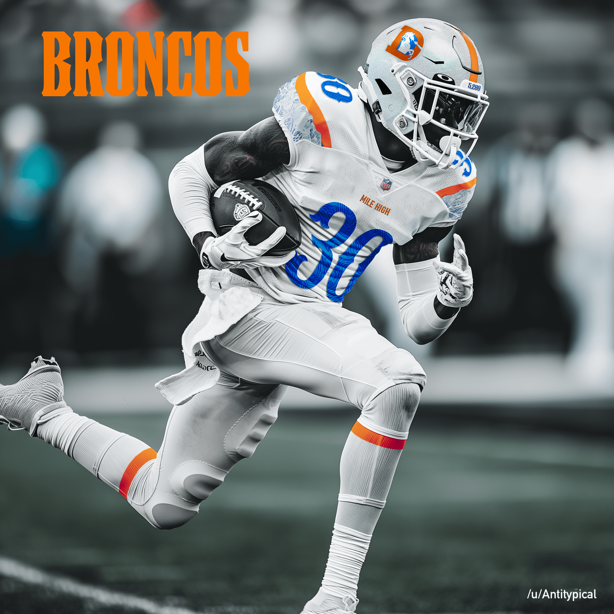
I recently heard about the uniform redesign you guys are undergoing, and as I looked into it, I saw elements I really liked but overall concept sketches that felt lackluster. I decided to take some of the elements of what people were suggesting were in the works and turn them into my own concept.
**Here are the things I liked**
1. The “snow-cap”: A helmet that evokes winter 2. Mountains on the sleeves 3. Topographical lines on the numbers 4. 5,280 placed somewhere
I wanted to make something that incorporated these elements but rebuilt the rest of the uniform from the ground up (this post is not aiming to predict your new uniform) **So I got to work.**
1. Made a mood board with some visual inspiration 2. Generated a “NFL player in an all-white uniform with no numbers or decorations of any kind” on Midjourney 3. Cleaned up the AI model with photoshop. Despite the prompt there was plenty of AI garbage to clean up 4. Built the concept with photoshop
[Here’s a detailed explainer of some of my creative choices](https://i.imgur.com/PLKyHXl.jpeg). My overall goal with this concept was to mainly use classic elements (simple layouts, classic striping, etc) combined with creative details that would feel really custom to Denver, or Colorado more broadly. **I wanted the final product to look modern but I wanted the novel elements to evoke some nostalgia.** As an avid skier, I love the timeless work of James Niehues, and while western fonts are admittedly kitschy, they’re also iconic.
(*Quick note on this: By far the hardest part was choosing a font for the numbers. I went back and forth and eventually chose something western and old-timey, but I struggled a lot deciding between that and a more modern font ([which I mocked up as well](https://i.imgur.com/83KoW37.jpeg))*)
**Finally:** I wanted to design a new logo, and planned to take an approach inspired by many of the iconic ski areas in Colorado (in particular, A-basin), but this project got ahead of me and I instead went with a tested classic which worked well within the design aesthetic I had chosen.
**At this point you might be asking why I chose to do this project.** The short answer is that besides being disappointed with some of the mocks that were coming out, I have many family and friend ties both to Colorado and the southwest more broadly, and spend a significant amount of time there each year. While I am a Bears fan, I’ve been to several games at Mile High (Sports Authority at the time?) and have always had a great time.
**Anyway, let me know what you think– I hope you don’t hate it!**
These aren’t the worst jerseys I’ve seen, but they just have an all-star game look to them and don’t feel unique to the Broncos
Not enough Orange/Blue
I’m not sure about the “Wagyu Beef” sleeves.
I unironically love the western style font
I love it, big fan of the number style/details and clean all-white look, thanks for sharing!
This will be 10000% better than whatever they unveil here in April.
I love every white helmet with the old logo on it. Just so damn pretty
I like these alot
I think that’s a good uniform for a Thursday night game if we’re on the road. Pretty old-school so I like more orange and blue myself.
Thanks god. I was afraid no one would do a speculative render of the new uniforms! /s
This isn’t what they said we are getting at all though. Team president said the logo and colors are not changing.
These feel like an amalgamation of Wyoming and Boise States uniforms. They’re cool, but don’t feel like a professional team at all
I would like these instead of the all orange for color rush.
I’m not crazy about the font or the mountains, but I appreciate the effort. I like the color choice. Unfortunately for this design, ownership has already said they’d be keeping the current color scheme and logo
But you did good work and I’m sorry folks get so contentious about uniforms
Honestly these will probably be better than what we get.
It’s a nice mock, but this is pretty far from what what the direction is. The logo is staying the same, white will very likely not be a primary color outside of an alternate (thus no white helmet outside of that either), and they’ve stated the colors are staying the same. The tease shows a slight alteration of shade of the orange and navy, but the blue is still navy nonetheless.
I like the “Broncos” logotype a lot though. Much less generic than the current one.
Don’t approach design by committee. You absolutely cannot please everyone and trying to will make for bland corporate shit.
They’re not changing the logo or colors
If the Broncos uniforms were these I’d be more than happy. Wouldn’t mind the helmet being blue but these would be absolutely solid.
I don’t know if anyone else feels this way, but I hate the white helmet. Looks too much like the Bills. I don’t mind any of the other jersey/pant color combos, as long as the helmet is the new or old blue color.
Needs more Pop.
those numbers can get, I don’t like em.
Not here for the numbers at all.
That’s 100% not a way Mike would go on a pro set.
The numbering should be the color rush numbering imo
Man this are some good looking unis. I’m going to be pissed if the new ones don’t look this good.

26 comments
Hello Broncos Fans!
I recently heard about the uniform redesign you guys are undergoing, and as I looked into it, I saw elements I really liked but overall concept sketches that felt lackluster. I decided to take some of the elements of what people were suggesting were in the works and turn them into my own concept.
**Here are the things I liked**
1. The “snow-cap”: A helmet that evokes winter
2. Mountains on the sleeves
3. Topographical lines on the numbers
4. 5,280 placed somewhere
I wanted to make something that incorporated these elements but rebuilt the rest of the uniform from the ground up (this post is not aiming to predict your new uniform) **So I got to work.**
1. Made a mood board with some visual inspiration
2. Generated a “NFL player in an all-white uniform with no numbers or decorations of any kind” on Midjourney
3. Cleaned up the AI model with photoshop. Despite the prompt there was plenty of AI garbage to clean up
4. Built the concept with photoshop
[Here’s a detailed explainer of some of my creative choices](https://i.imgur.com/PLKyHXl.jpeg). My overall goal with this concept was to mainly use classic elements (simple layouts, classic striping, etc) combined with creative details that would feel really custom to Denver, or Colorado more broadly. **I wanted the final product to look modern but I wanted the novel elements to evoke some nostalgia.** As an avid skier, I love the timeless work of James Niehues, and while western fonts are admittedly kitschy, they’re also iconic.
(*Quick note on this: By far the hardest part was choosing a font for the numbers. I went back and forth and eventually chose something western and old-timey, but I struggled a lot deciding between that and a more modern font ([which I mocked up as well](https://i.imgur.com/83KoW37.jpeg))*)
**Finally:** I wanted to design a new logo, and planned to take an approach inspired by many of the iconic ski areas in Colorado (in particular, A-basin), but this project got ahead of me and I instead went with a tested classic which worked well within the design aesthetic I had chosen.
**At this point you might be asking why I chose to do this project.** The short answer is that besides being disappointed with some of the mocks that were coming out, I have many family and friend ties both to Colorado and the southwest more broadly, and spend a significant amount of time there each year. While I am a Bears fan, I’ve been to several games at Mile High (Sports Authority at the time?) and have always had a great time.
**Anyway, let me know what you think– I hope you don’t hate it!**
**Edit:** [A BLUE ONE](https://i.imgur.com/KHdxauo.jpeg)
These aren’t the worst jerseys I’ve seen, but they just have an all-star game look to them and don’t feel unique to the Broncos
Not enough Orange/Blue
I’m not sure about the “Wagyu Beef” sleeves.
I unironically love the western style font
I love it, big fan of the number style/details and clean all-white look, thanks for sharing!
This will be 10000% better than whatever they unveil here in April.
I love every white helmet with the old logo on it. Just so damn pretty
I like these alot
I think that’s a good uniform for a Thursday night game if we’re on the road. Pretty old-school so I like more orange and blue myself.
Thanks god. I was afraid no one would do a speculative render of the new uniforms! /s
This isn’t what they said we are getting at all though. Team president said the logo and colors are not changing.
These feel like an amalgamation of Wyoming and Boise States uniforms. They’re cool, but don’t feel like a professional team at all
I would like these instead of the all orange for color rush.
I’m not crazy about the font or the mountains, but I appreciate the effort. I like the color choice. Unfortunately for this design, ownership has already said they’d be keeping the current color scheme and logo
But you did good work and I’m sorry folks get so contentious about uniforms
Honestly these will probably be better than what we get.
It’s a nice mock, but this is pretty far from what what the direction is. The logo is staying the same, white will very likely not be a primary color outside of an alternate (thus no white helmet outside of that either), and they’ve stated the colors are staying the same. The tease shows a slight alteration of shade of the orange and navy, but the blue is still navy nonetheless.
I like the “Broncos” logotype a lot though. Much less generic than the current one.
Don’t approach design by committee. You absolutely cannot please everyone and trying to will make for bland corporate shit.
They’re not changing the logo or colors
If the Broncos uniforms were these I’d be more than happy. Wouldn’t mind the helmet being blue but these would be absolutely solid.
I don’t know if anyone else feels this way, but I hate the white helmet. Looks too much like the Bills. I don’t mind any of the other jersey/pant color combos, as long as the helmet is the new or old blue color.
Needs more Pop.
those numbers can get, I don’t like em.
Not here for the numbers at all.
That’s 100% not a way Mike would go on a pro set.
The numbering should be the color rush numbering imo
Man this are some good looking unis. I’m going to be pissed if the new ones don’t look this good.