If you zoom into the nameplate there’s subtle topographic lines 👀
16 comments
So date seems to be the jersey font. Makes sense to differentiate from D logo uniforms. Like classic blocks best BUT at least the twos look better imo
hope you guys like triangles
There it is!
Maybe I’m in the minority but I’m huge on the topographical lines / the mountains on the sleeves. The Jets just released their new unis and even though they’re cool, there’s something missing. Almost too stale and bland. If Denver’s unis are just like that, plus a little added touch with the lines / mountains. Count me all the way in
Darker than I thought but not bad
I know it’s the date but you know who ran a 4.22 40? Xavier Worthy.
Idk if it’s the lighting, but the blue on the cleats looks like a different shade of blue than the previous navy. Looks lighter
These are going to be GOATED if the org put as much effort into designing these jerseys while taking into account what the fans asked for as they have put into preventing the kits from leaking online.
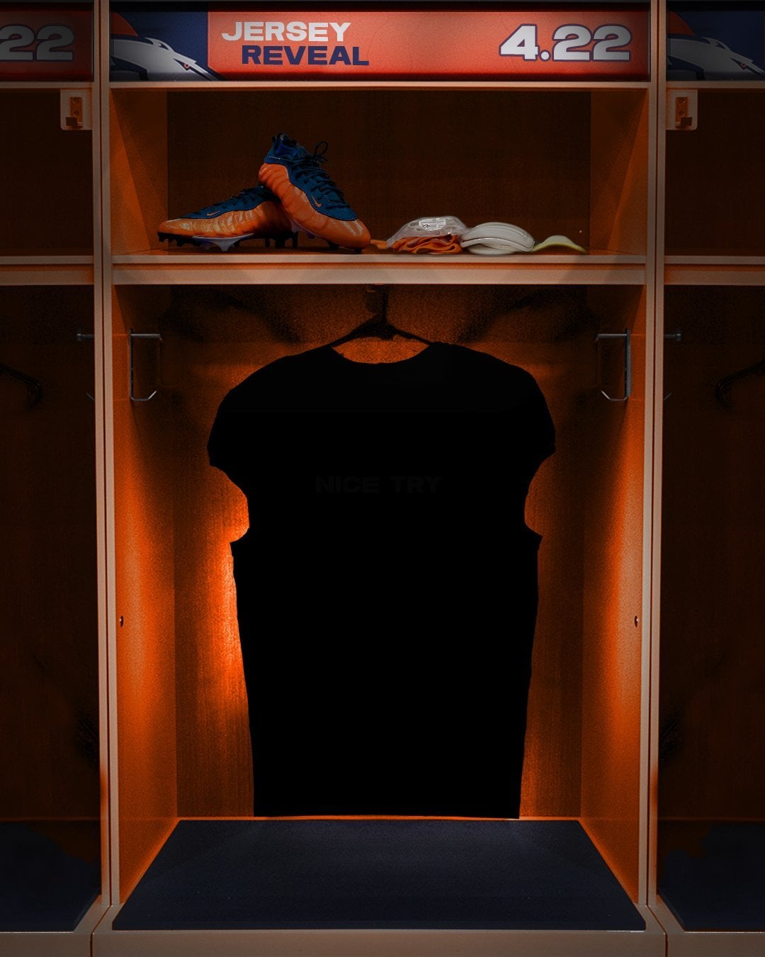
If you edit the picture the jersey says “nice try” 😂

Vanta black is a bold choice
Can someone over there get the message that the wait serves no point? Just release an image and get to work. Enough of the gimmick.

16 comments
So date seems to be the jersey font. Makes sense to differentiate from D logo uniforms. Like classic blocks best BUT at least the twos look better imo
hope you guys like triangles
There it is!
Maybe I’m in the minority but I’m huge on the topographical lines / the mountains on the sleeves. The Jets just released their new unis and even though they’re cool, there’s something missing. Almost too stale and bland. If Denver’s unis are just like that, plus a little added touch with the lines / mountains. Count me all the way in
Darker than I thought but not bad
I know it’s the date but you know who ran a 4.22 40? Xavier Worthy.
ENHANCE
lol, if you try to brighten it to see the jersey, it says “nice try” https://x.com/henrychisholm/status/1780341903302517201?s=46
Idk if it’s the lighting, but the blue on the cleats looks like a different shade of blue than the previous navy. Looks lighter
These are going to be GOATED if the org put as much effort into designing these jerseys while taking into account what the fans asked for as they have put into preventing the kits from leaking online.
If you edit the picture the jersey says “nice try” 😂

Vanta black is a bold choice
Can someone over there get the message that the wait serves no point? Just release an image and get to work. Enough of the gimmick.

Not to be negative, but those cleats are ugly.