
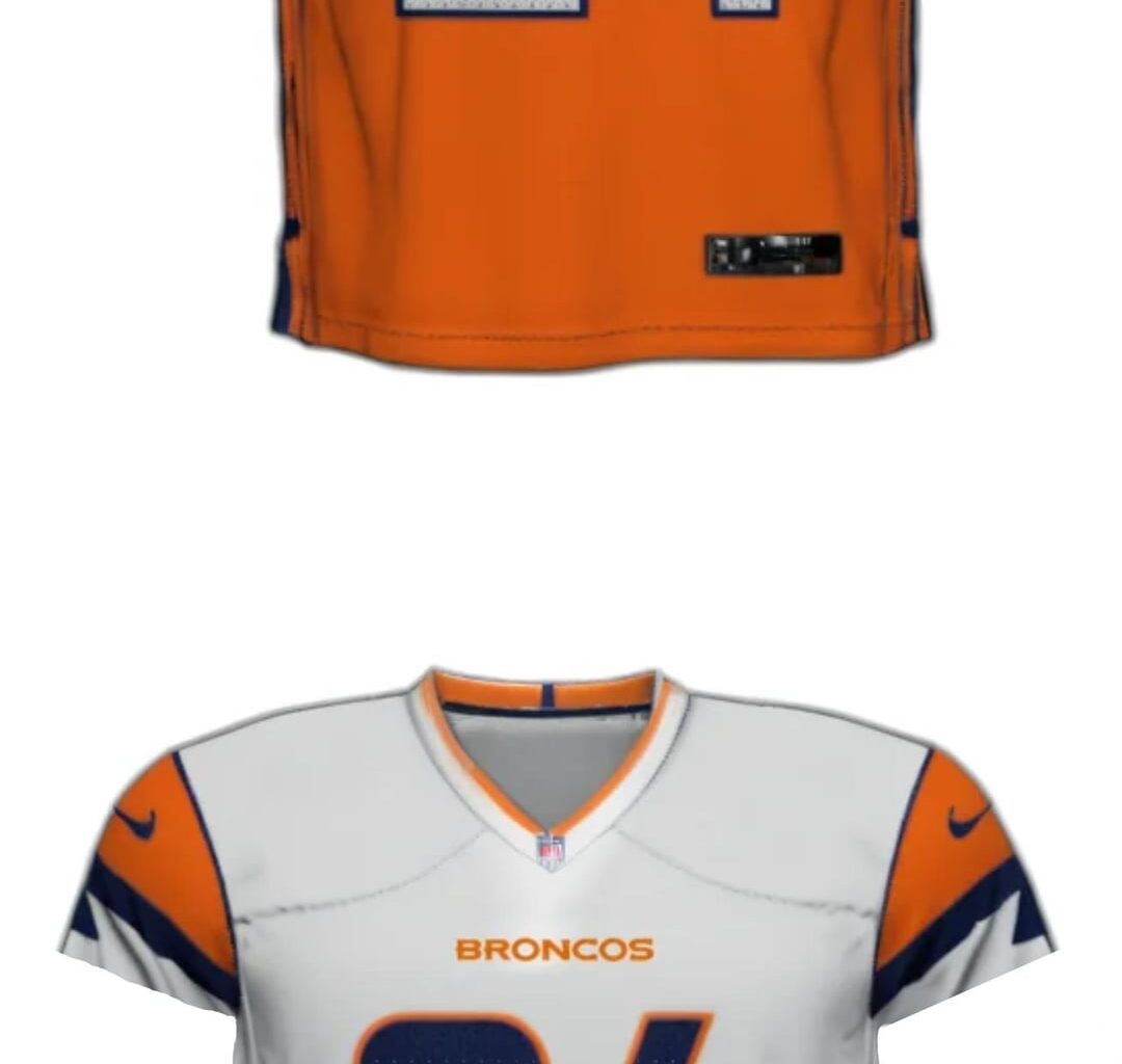
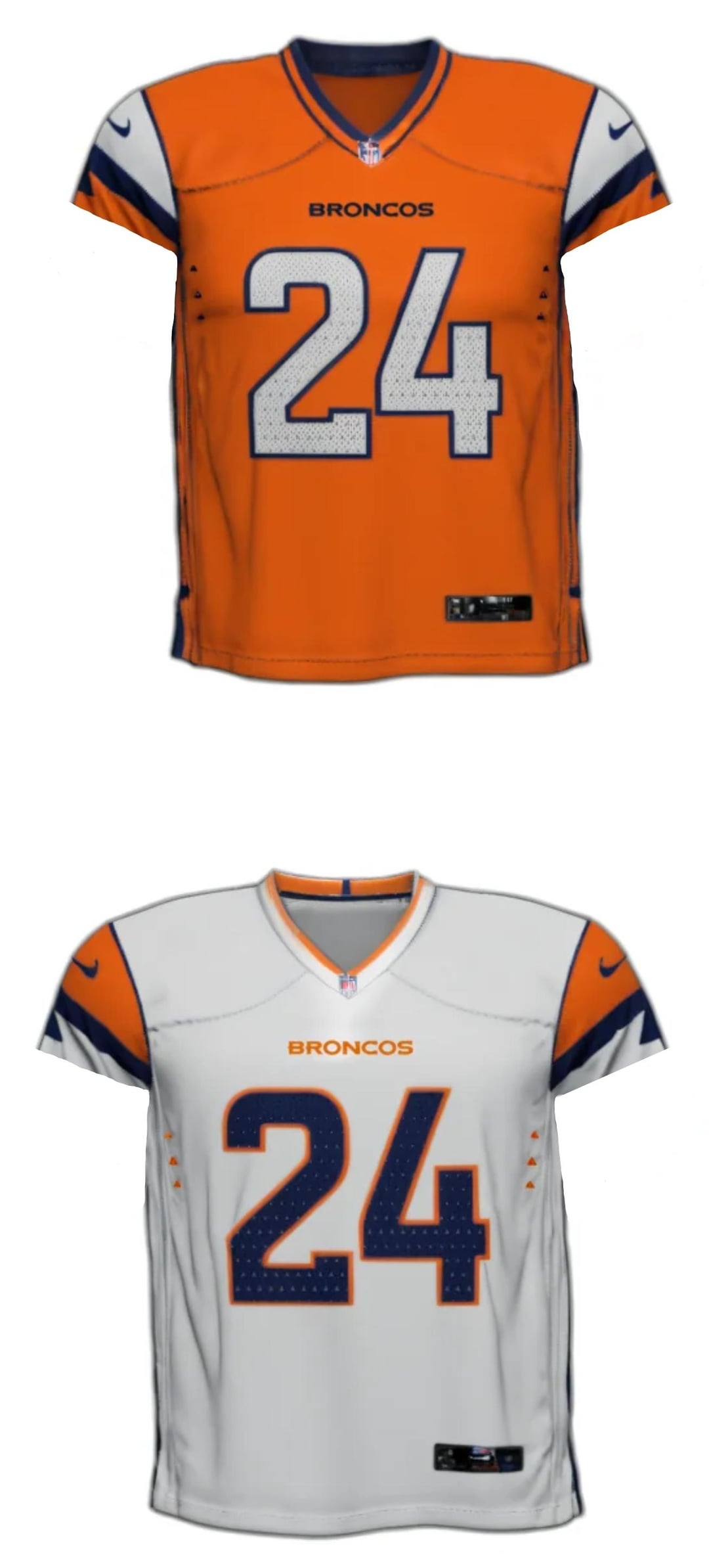
These images look to be the customer jerseys from Fanatics and the other retailers with the long sleeves.
Also adding the color rush jerseys as an example between a player game day jersey and fanatics jersey for sale to the public.
What do you think about them with the shorter sleeves?
14 comments
These are like the wild donkey days of jerseys
They still suck tbh
Why are we using the chargers bolt design on our sleeves
🤢🤮
I honestly don’t think they’re that bad.
I’m 100% confident that most people shitting on these will be saying different once they’re revealed
Is it what we all wanted? No.
Is it as bad as people are pretending? No.
Battle of mid
I actually like the white one. Not so much the orange tho
It’s starting to grow on me, we need to see it in pads and full uniform
Really all they could have done was keep the color rush, add white pants, add an away set to match that and it would be done. Instead we are getting this.
I seriously don’t hate them. Jersey nerds will never be satisfied. If there’s a lot going on it’s too busy, if it’s simple it’s boring. I think these are a unique without looking like an arena league concept. If they stop selling the screen printed bullshit and go back to stitched I would consider one.
Use the Nike fuse template
That shade of orange is hideous. I hope it looks better in person cause those renders made it look just God awful
Yep. Looks stupid.
I think im actually really gonna like these. Gotta see them with the pants and helmet