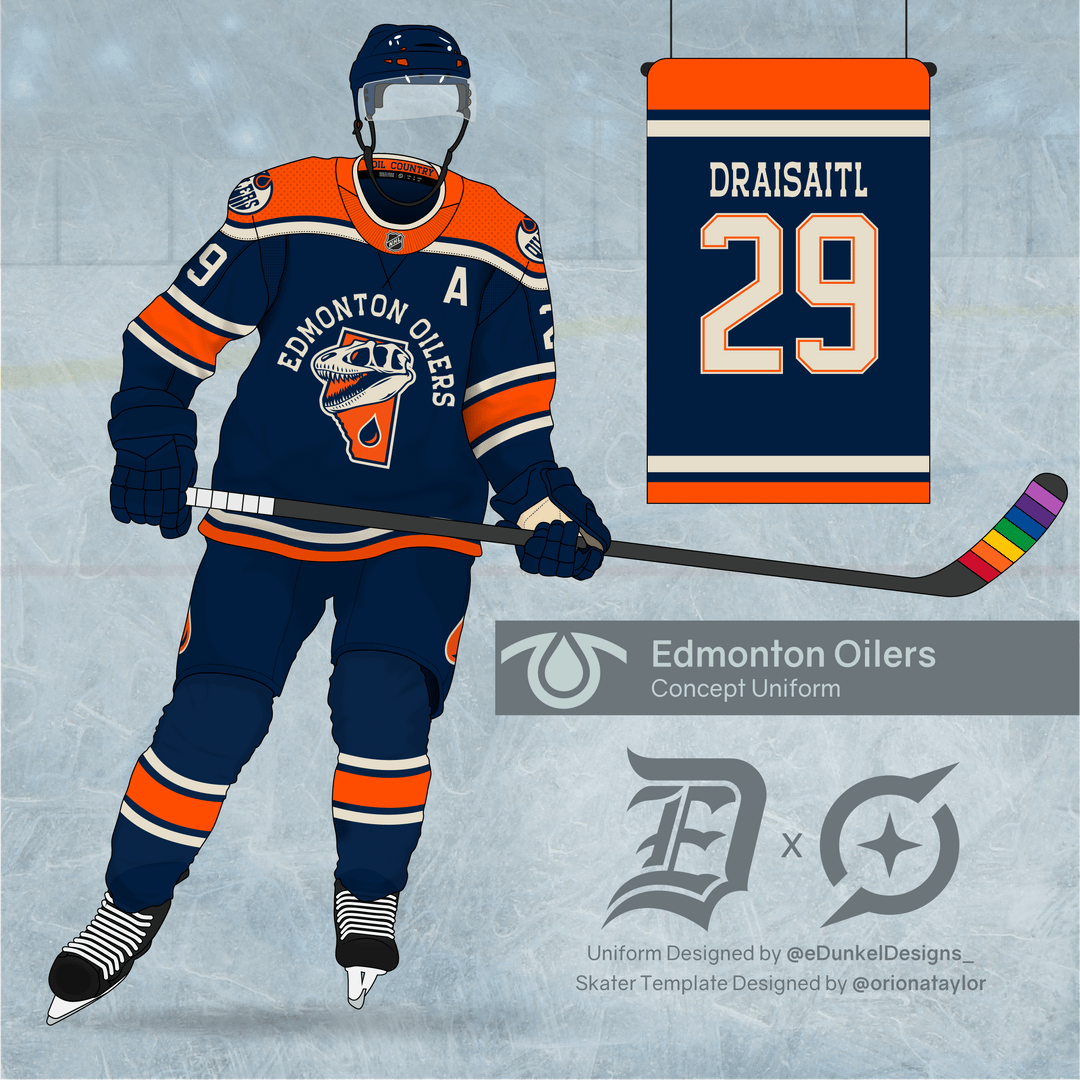
With some of your great suggestions and criticisms, I made some tweaks to the logo and decided to make an old-school mock-up of the logo on a uniform. Thanks again for all the feedback, and I’m glad so many of you enjoyed it. Good luck in the playoffs!
[removed]
I would place the Oil drop where Edmonton is in Alberta, not where Calgary is.
I think the logo would work better as a shoulder patch, but that’s just my own opinion
I like this look with the oil drop. Thanks
I appreciate the design, especially with your notes for why you made it the way you did (I saw the other post but didn’t comment), but it’s really not satisfying for me. I’m not a designer but I’m not a fan of this and I’m not sure why. I actually preferred the original one you shared over this, but still it’s not something I’d like to see.
Edit: As someone else said, maybe it would be cool as a small patch, but not for a main jersey logo.
The Alberta Dinosaurs
I associate Dinosaurs with Drumheller, which is twice as far to Edmonton as it is to Calgary. It is a great concept, just not for Edmonton IMO.
Also, not to get super nerdy, but petroleum did not come from dinosaurs.
Bring back copper
I don’t really get the skull,but not bad overall!
Terrible
Even though it’s a bit raw, it’s actually pretty good.
No
Dust
Great jersey. Logo is waaaayyyy too busy. Pick a theme, and remove the team name. Use the “Pencil Case” rule for logo and flag design. It should be simple enough that a young student can draw it on their pencil case from memory.
Gross 🤢
This is ok, but it feels more relevant to calgary. I’d like to see a jersey that has a main crest of that rigger shoulder patch of the early 2000s jersey. Lots of copper
Why he got the pride tape💀
I don’t feel dinosaurs are associated with Edmonton at all (it’s more of a southern Alberta thing I would think). And like someone else said, the oil drop seems to be pointing at Calgary. Also the dinosaur thing makes me think you’re insulting the Oilers organization (a bunch of old dinosaurs – which is probably close to the truth).
I’m not sure portraying a dynamic team as something that has been dead for 5 million years is the best choice for a logo. Similar to the Canucks logo with a skate going downhill. Not quite the right vibe.
K but imagine if it were a silhouette of Ryan Smyth’s head/mullet instead of a dino skull

21 comments
With some of your great suggestions and criticisms, I made some tweaks to the logo and decided to make an old-school mock-up of the logo on a uniform. Thanks again for all the feedback, and I’m glad so many of you enjoyed it. Good luck in the playoffs!
[removed]
I would place the Oil drop where Edmonton is in Alberta, not where Calgary is.
I think the logo would work better as a shoulder patch, but that’s just my own opinion
I like this look with the oil drop. Thanks
I appreciate the design, especially with your notes for why you made it the way you did (I saw the other post but didn’t comment), but it’s really not satisfying for me. I’m not a designer but I’m not a fan of this and I’m not sure why. I actually preferred the original one you shared over this, but still it’s not something I’d like to see.
Edit: As someone else said, maybe it would be cool as a small patch, but not for a main jersey logo.
The Alberta Dinosaurs
I associate Dinosaurs with Drumheller, which is twice as far to Edmonton as it is to Calgary. It is a great concept, just not for Edmonton IMO.
Also, not to get super nerdy, but petroleum did not come from dinosaurs.
Bring back copper
I don’t really get the skull,but not bad overall!
Terrible
Even though it’s a bit raw, it’s actually pretty good.
No
Dust
Great jersey. Logo is waaaayyyy too busy. Pick a theme, and remove the team name.
Use the “Pencil Case” rule for logo and flag design. It should be simple enough that a young student can draw it on their pencil case from memory.
Gross 🤢
This is ok, but it feels more relevant to calgary. I’d like to see a jersey that has a main crest of that rigger shoulder patch of the early 2000s jersey. Lots of copper
Why he got the pride tape💀
I don’t feel dinosaurs are associated with Edmonton at all (it’s more of a southern Alberta thing I would think). And like someone else said, the oil drop seems to be pointing at Calgary. Also the dinosaur thing makes me think you’re insulting the Oilers organization (a bunch of old dinosaurs – which is probably close to the truth).
I’m not sure portraying a dynamic team as something that has been dead for 5 million years is the best choice for a logo. Similar to the Canucks logo with a skate going downhill. Not quite the right vibe.
K but imagine if it were a silhouette of Ryan Smyth’s head/mullet instead of a dino skull