
If not allowed, please delete! I come in peace
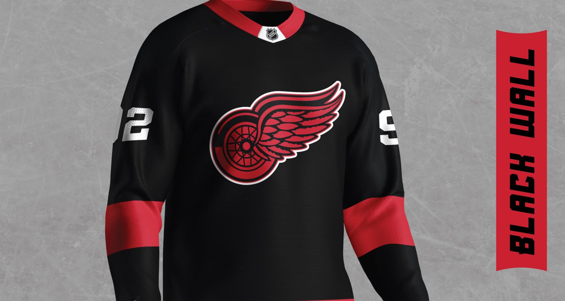
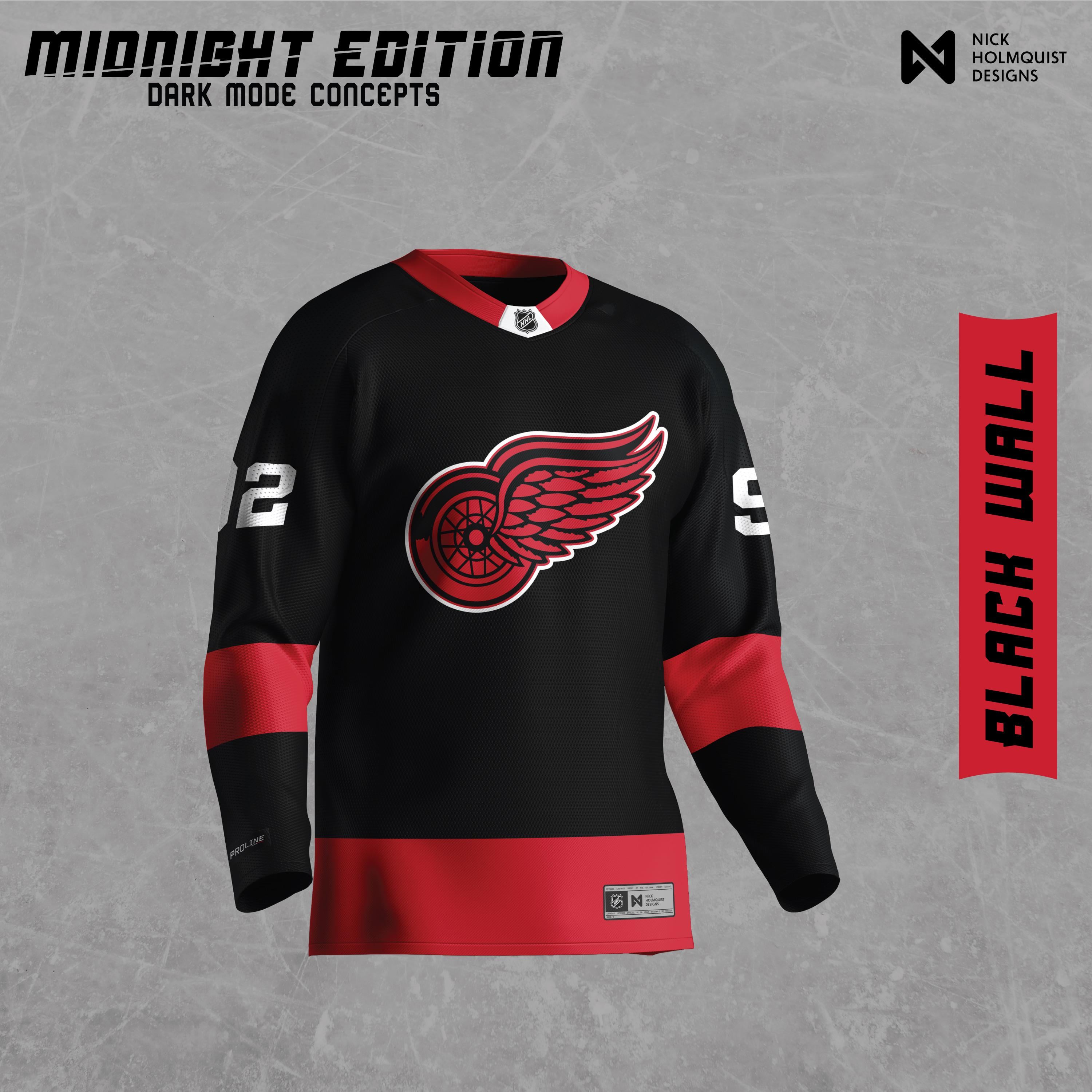
I decided to make a "dark mode" jersey for all NHL teams.
I'm mainly doing this for my benefit as a designer to learn more about how teams have constructed their jerseys, logos, and colors. This was a lot of fun and I hope you all enjoy!
33 comments
Creative!
I love it, great job
Might put a little more white in the logo, but I’d buy it.
Edit: OR black out the logo and outline it in red, with some red and/or silver/white accents.
Okay, I’ll stop now.
Certainly a cool concept! I think it looks too similar to a Canes jersey to use though
Maybe add some white trim on the sleeves between the red and black. But I dig it overall.
Definite old black Starter jersey vibes, I have a Fedorov one laying around here somewhere…
Cool concept.
Still a no. Red and white only in my mind. But a creative concept!
fine, take my money
Interesting exercise, but hell no! Looks like Carolina.
Red and white should be the only colors Detroit ever wears.
I need to see the priority patch on it….
good work but i cannot stand black in any detroit team color scheme
Jesus Christ those are heinous
Unreal
It’s a cool design. But I’m one of those fans that doesn’t want black on a wings jersey ever again. Ref and white!
I really dislike this! But the execution is great!
No

Great concept! Definitely one of the better ones I’ve seen
As far as conceptualizing alternate Wings jerseys, I’d say this is a good design. Personally, I’m just not a fan of black Wings jerseys.
I agree with another commenter that it could use a little more white. Horizontal white lines on the sleeve would be an easy, but expected addition. I’m wondering if some white accent designs that resemble feathers (like in the Wing) or the spokes of the wheel could be added somehow to spice it up.
Love the effort! Let’s stop trying to make black a thing for the wings tho lol. If anything purple for Al or silver/gray but even those are meh
Applaud the creativity, but absolutely not!
I don’t see a garbage logo.
No priority patch off to a good start..
This is awful, but great work!
Like others, it looks great but not for the Wings.
Ugly af
I like this more than the reverse retros. If you are going to incorporate black this is how to do it as a whole blackout concept
Just no. Kinda like the Shitcago version, you can’t change colours in the logo itself. That is sacrilege. A step to far.
Give me a white in the logo and white borders on with red lettering/numbers and I could get behind this.
Poop from a butt
Maybe reverse
I like it, besides the white/silver numbers. But damn its sexy tho
A black red wings jersey is always a hard pass. Wings colors are red and white.
You’d win everyone over here if you’d come back with a cream/beige variant like our 2014 Winter Classic.