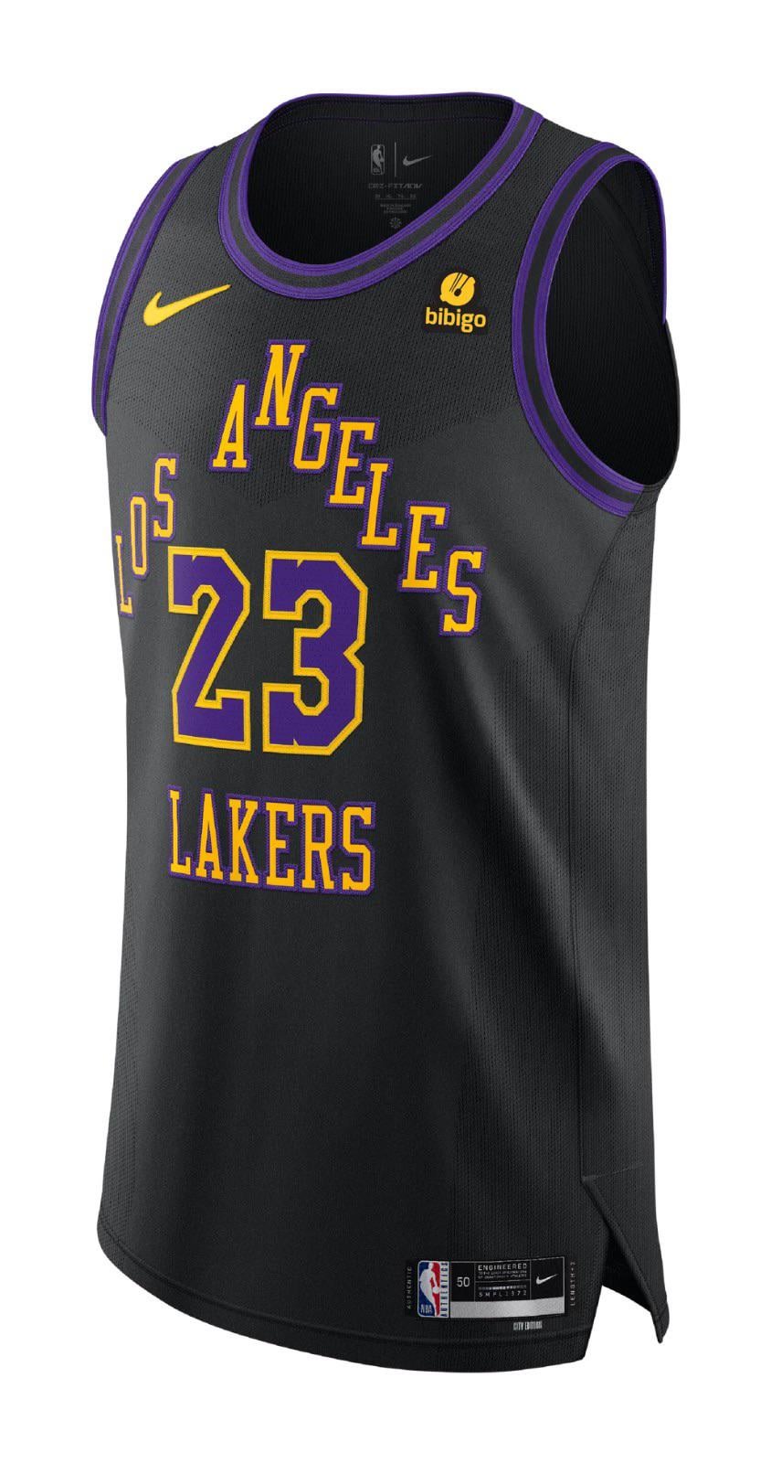
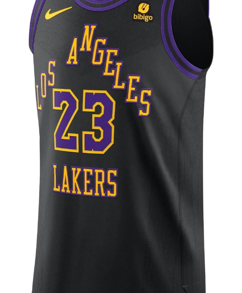
Now that time has passed, can we admit that this jersey is one of our best recently?
November 26, 2024
Such a underrated jersey, looked so good in game too.
37 comments
Very underrated imo
Yup, I love these jerseys🔥
I still do not like this jersey.
Hell nah
Love the colors, hate the letterings
Looks like a broken pyramid of letters. No flow whatsoever, so no I won’t be admitting anything today
I would like to add that i really liked the baby blue trowback ones, and the all white with blue letters. They were perfect for the Christmas game.
Look like a fourth grade design. Triangular text layout is a miss, and the execution is worse.
Absolutely. Looks better every day too.
1) Black Mamba jersey
2) Sunday whites
3) MPLS/UCLA ones
The “home” jerseys are too yellow. The “away” jerseys would look better without the black or at least a skinnier black side. I love the colors from the jersey in this post but hate that off-set lettering ~ but, it’d look amazing with just Lakers and the number below.
honestly haven’t liked a jersey the lakers have put out since the mamba city editions. including the current home and road unis.
preferred when we wore *gold* at home except on sundays, and the ol forum blue on the road. maybe throw in the mambas and the old school blues once in a while.
gotta get that money tho, put out shitty new jerseys every year for people to buy.
Lol that shit is ass
Straight trash. Murakami couldn’t help
I get OC looking at this jersey.
No
Not a chance, undercover OP that designed this God awful mistake to human eyes and affront to nature
I like it but the best ones are still the blue throwback Los Angeles ones and the mamba ones
I liked they way they looked in nba 2k24
I have that jersey and love it
It’s okay, but I’m over the whole city jersey experience
Genuinely want to know what peoples issue with this jersey is? Is it the lettering format? The font? The colors? The only issue I see is the way the letters are a triangle but, aside from that I think these jerseys aren’t bad, not great, but not terrible.
The back was nice the front is still ass 🦨
OP, I’m with you on this unpopular opinion. 🫡
These are ass lol
I find it terrible 😢. The letters do not follow a clear concept and the spacing is poor
I like this one, I like the one right now. Don’t get the hate but that’s just my taste.
I think it’s bad, but the rest of the bullshit jerseys have been fucking awful, so you are technically correct.
to be fair, I’ve hated all of the gimmick jerseys, with the exception being the [Hollywood Nights](https://i.pinimg.com/736x/f0/1b/2b/f01b2b1afe6fb9cc0433e5b9347d6c20.jpg) jersey. Otherwise it should stay as Gold at Home, White on Sundays, Forum Blue on the Road, stupid wacky jerseys for Holidays
It was a throwback to how jerseys used to look. I think it looked good, but it was nothing spectacular.
Time didn’t need to pass, this one and the mamba one are our best couple jerseys recently
Mamba Jerseys from 2020 on top
No jersey has been good since 2017
No, it’s one of the worst, easily.
They grew on me. Was considering purchasing one but never did
The colors were excellent but the font positioning is god awful.
I liked the purple with blue and white trim even though that was a shit season
Nah it’s ass
Idk, they should bring back the original. I miss the predominant yellow.