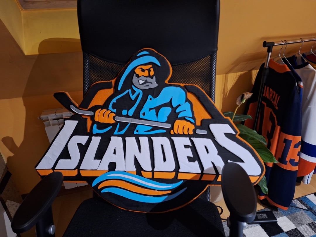
I've made fisherman logo 3 months ago and finished standard one today. Maybe it's not perfect but i tried to make it look good. What's your opinion?

I've made fisherman logo 3 months ago and finished standard one today. Maybe it's not perfect but i tried to make it look good. What's your opinion?
7 comments
My opinion is that these are excellent! Good work! The 3D depth effect from the different layers really pops, especially on the standard logo.
Very good now build us a better roster
inb4 a bunch of very funny people make a remark about how bad the team is
Also, looks awesome!
Looks so cool! Great job
I appreciate you did the original and not that weird redux from last year
Any ideas for next projects? I like doing diy things…
Not bad 👍🏻