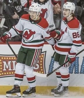
after asking what your favorite jersey and what you guys think of the rr2.0, now i want to know what you all think of this jersey. personally i believe this this jerseys pretty solid, not my favorite or least favorite.

after asking what your favorite jersey and what you guys think of the rr2.0, now i want to know what you all think of this jersey. personally i believe this this jerseys pretty solid, not my favorite or least favorite.
27 comments
Old colors better than the Rockies retros. I still wish they would just take our standard jersey and invert the colors to black jersey with white logos/stripes. The “jersey” logo just never did it for me
i like this version over the solid color version.
Love them ,
Best devils jersey
Fantastic looking throwbacks with my only critique being that I want the green stroke around the red shoulder yoke to be thicker (like how buffalo’s road jersey is) so that it is slightly more accurate to the original jerseys. White base with red shoulders and green pants is a great looking color set on home ice for the handful of games they would break it out each season.
Also so glad they got rid of the stink of literally never winning a game in them prior to 22-23 because I used to think these uniforms were cursed.
Love both the red and white ones, as well as the Reverse Retro 1.0. We need to see all three more often. I actually use these more often than the standard home and away unis when I play EA NHL games
https://preview.redd.it/f7p1jtjqz3je1.jpeg?width=736&format=pjpg&auto=webp&s=b4f1e1651d9b509c9ab0de3ecbde3e57f3a1558f
They look great when you are winning!
Heater of a jersey. One of our best. I need a Bratter one still
Love em.
Love them. Really wish the devils would go back to Red/Green all the time, as the green was supposed to represent the Pine Barrens, and the switch to black was when every team wanted the color black to sell more Starter jackets.
Absolutely the best retro jersey. Shouldn’t be wasting time wearing those Colorado colors which have no true relevance to the Devils.
I grew up with them as the devils home jersey and love them and the road red as well.
They’re neat
I got a Dougie one for like 72 dollars when fanatics took over from addidas clearance. Absolutely gorgeous
Our best white jerseys we’ve ever had
Bring back the Christmas colors!
I like em!
Sick as buck
Should be the full time road uniforms
Love em next question
Way better than current home and away . Them taking way the bottom
Stripes are a big mistake
Excellent!!!
I dig the green more and more every time they bring it back on the ice or in merch!
I say bring it back full-time!
Should be new full time & the Green reverse retro as the third.
I like them. Much better than the “Jersey” jersey
Fire
Meh, not bad. I often wear that shade of green with my Devils merch to pay hamage to the time before I was a fan.
Best uniform