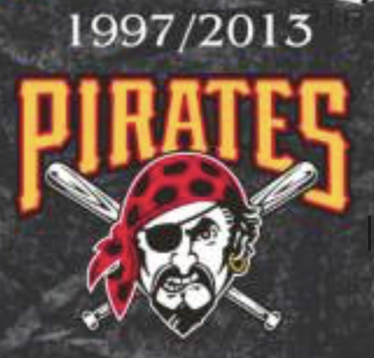
Do you miss this old pirates logo? Or was it time to move on
February 16, 2025
Do you miss this old pirates logo? Or was it time to move on
26 comments
No
It’s the one before this I miss.
This one felt a little goofy, to be honest.
I miss it, but it was time to move on
I liked it
Time to move in I’d say. I didn’t love this one. I liked the one before this
No
This one looks minor league. 1968-1986 was solid
The logo design itself is fine. There is just too much red.
Screw Bob nutting
It’s associated with nothing but the Pirates being ass and a colossal embarrassment and I’d be cool if it was wiped off the face of the earth forever
It’s time for a logo where the Pirate wears a hat again.
I’ve never noticed the pirate has a chew in.
Love the logo, hate the owner
This logo is synonymous with the losing era.
Incredible logo but needed to go
It was the most interesting part of those early aughts teams
I miss it. Logos are becoming too bland
I do not miss that logo. It’s not that the logo itself is too bad, it’s just that it represents so much losing and almost no winning. It’s hard to get nostalgic for something that represented almost universally failing baseball teams.
Also, I think the most basic expectation of any Pittsburgh sports fan is that the teams wear black and gold.
I mean, let’s be real. What else has this organization given anyone in the last 40 years other than a nice ballpark and traditional black and gold uniforms. That’s basically it. We did have three good seasons in there, but none of them even resulted in a single divisional championship, so even they weren’t that great.
Unfortunately, the Pirates have long been the gang that can’t shoot straight and it was only a matter of time before they would fuck up the minimal uniform expectation too. It’s just who they are.
We are Pittsburgh. We are the Pirates. We are black and gold. How basic can you get? More to the point, how could you possibly fuck that up? Like life, they will find a way.
I grew up with this logo and have it etched onto my wallet. It was also on my childhood window
Cursed logo
My general thoughts on the bandana Pirate (jolly roger) logo:
All this to say, I think the current look the Pirates have is phenomenal. I love how the Pirates simultaneously have a logo patch/secondary logo that has the freedom to look good on its own without needing to subscribe to only black and yellow, all while also limiting their uniform elements to only black and yellow – both working together separately to balance each other out and provide a cohesive, balanced presentation.

26 comments
No
It’s the one before this I miss.
This one felt a little goofy, to be honest.
I miss it, but it was time to move on
I liked it
Time to move in I’d say. I didn’t love this one. I liked the one before this
No
This one looks minor league. 1968-1986 was solid
The logo design itself is fine. There is just too much red.
Screw Bob nutting
It’s associated with nothing but the Pirates being ass and a colossal embarrassment and I’d be cool if it was wiped off the face of the earth forever
It’s time for a logo where the Pirate wears a hat again.
I’ve never noticed the pirate has a chew in.
Love the logo, hate the owner
This logo is synonymous with the losing era.
Incredible logo but needed to go
It was the most interesting part of those early aughts teams
I miss it. Logos are becoming too bland
I do not miss that logo. It’s not that the logo itself is too bad, it’s just that it represents so much losing and almost no winning. It’s hard to get nostalgic for something that represented almost universally failing baseball teams.
Also, I think the most basic expectation of any Pittsburgh sports fan is that the teams wear black and gold.
I mean, let’s be real. What else has this organization given anyone in the last 40 years other than a nice ballpark and traditional black and gold uniforms. That’s basically it. We did have three good seasons in there, but none of them even resulted in a single divisional championship, so even they weren’t that great.
Unfortunately, the Pirates have long been the gang that can’t shoot straight and it was only a matter of time before they would fuck up the minimal uniform expectation too. It’s just who they are.
We are Pittsburgh. We are the Pirates. We are black and gold. How basic can you get? More to the point, how could you possibly fuck that up? Like life, they will find a way.
I grew up with this logo and have it etched onto my wallet. It was also on my childhood window
Cursed logo
My general thoughts on the bandana Pirate (jolly roger) logo:
* The logo looks best with a red bandana rather than a yellow bandana, where it especially pops against a [black background](https://i.ebayimg.com/images/g/1OsAAOSwntVmm~CU/s-l1200.jpg).
* While the 2001-2005 alternates [look great in a vacuum](https://www.milehighcardco.com/ItemImages/000029/28_27672a_lg.jpeg), the Pirates color scheme is **black and yellow**. That means, you shouldn’t muddy the look of the Pirates uniforms by forcing red into the wordmarks, piping, jersey color itself, cap crown, or cap bill.
* However, red can work GREAT when it’s isolated to the logo itself, such as when used as a jersey patch – which is something I think the Pirates have gotten right both all the way back [when the logo was introduced](https://i.ibb.co/g5S2XpX/download.jpg), and also [with their current uniforms.](https://img.mlbstatic.com/mlb-images/image/upload/t_16x9/t_w1024/mlb/uxw5crezccjbxncqhmzi) It also looks great as a [jolly roger cap logo](https://i.ibb.co/XkKXkMfx/image.png), and even as a [jersey logo](https://i.ibb.co/h6zKPdn/image.png) (okayyy…that’s pushing it).
All this to say, I think the current look the Pirates have is phenomenal. I love how the Pirates simultaneously have a logo patch/secondary logo that has the freedom to look good on its own without needing to subscribe to only black and yellow, all while also limiting their uniform elements to only black and yellow – both working together separately to balance each other out and provide a cohesive, balanced presentation.
Miss it
One of the ugliest logos
Bring back every single Pirates logo
No