I love the mountain one and the one with Quinn Meinerz
These are all great
Did you make forum signatures back in the day? These are taking me back.
hook one of these up ASAP. /u/aatencio91
Mountains or the one with PS2/Nix
Top of page 2 goes hard
Definitely the first one
Make 2 more and have them change monthly.
First or third
The first one is incredible. Would love to have it as the banner!
First one is amazing
Page 1 is the way to go. The 2 without players.
The first one or the 3rd on 2nd page
1, 4, or the all blue throwback
I like all of them lol. Any chance we can rotate them throughout the year?
JMP, these are excellent! The two front-runners for me are:
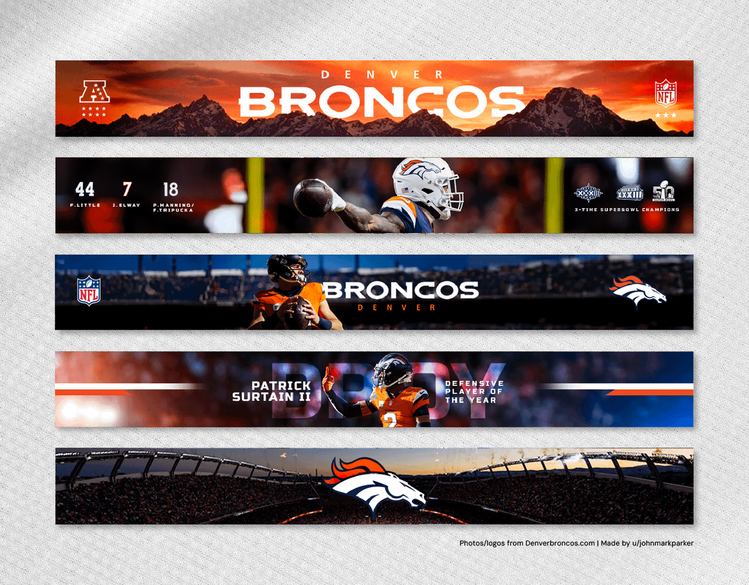
Pg. 1, Option 1: Love the simplicity of it. Very clever job of indicating SB wins and AFCW titles using the stars and logos. Overall feels very clean/modern, and is strikingly different from other banners I’ve seen by teams. If I have one quibble, it might be that the mountain range you’ve chosen does not feel Colorado enough, if that makes sense. I’m sure it is a CO range, but wondering if it might be more iconic/dramatic.
Pg. 2, Option 2: This is the clear winner for me. Just beautifully clean/nostaligic. The throwback uniforms, the slight color fade, the almost tilt-shift perspective. Just really evocative, subtle, and classy. The only change I’d make would be to lose the D/horsehead logo in the center — you don’t need it, and it clutters the main tag/address.
Well done!
(PS: Can we swap the sidebar soon? Mims has overstayed his welcome there, I fear.)
TOP!
Page 1 option 1 is the best one but that’s Mount Moran/the Tetons.. Haha odd choice to use Wyoming mountains
I love all of those but top is my fav
1. Mountains and Sunset
2. The one of the top of invesco field
3. Pat and Bo retros

25 comments
#4 is awesome
i like the very 1st one @ the top of the page
Sunset and mtns
I love the mountain one and the one with Quinn Meinerz
These are all great
Did you make forum signatures back in the day? These are taking me back.
hook one of these up ASAP. /u/aatencio91
Mountains or the one with PS2/Nix
Top of page 2 goes hard
Definitely the first one
Make 2 more and have them change monthly.
First or third
The first one is incredible. Would love to have it as the banner!
First one is amazing
Page 1 is the way to go. The 2 without players.
The first one or the 3rd on 2nd page
1, 4, or the all blue throwback
I like all of them lol. Any chance we can rotate them throughout the year?
JMP, these are excellent! The two front-runners for me are:
Pg. 1, Option 1: Love the simplicity of it. Very clever job of indicating SB wins and AFCW titles using the stars and logos. Overall feels very clean/modern, and is strikingly different from other banners I’ve seen by teams. If I have one quibble, it might be that the mountain range you’ve chosen does not feel Colorado enough, if that makes sense. I’m sure it is a CO range, but wondering if it might be more iconic/dramatic.
Pg. 2, Option 2: This is the clear winner for me. Just beautifully clean/nostaligic. The throwback uniforms, the slight color fade, the almost tilt-shift perspective. Just really evocative, subtle, and classy. The only change I’d make would be to lose the D/horsehead logo in the center — you don’t need it, and it clutters the main tag/address.
Well done!
(PS: Can we swap the sidebar soon? Mims has overstayed his welcome there, I fear.)
TOP!
Page 1 option 1 is the best one but that’s Mount Moran/the Tetons.. Haha odd choice to use Wyoming mountains
I love all of those but top is my fav
1. Mountains and Sunset
2. The one of the top of invesco field
3. Pat and Bo retros
The first one on the top of the page
I like the top ones of each page best