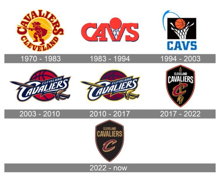
The “shield” logo is by far the worst logo the Cavs have ever had.
94-03 the best
83-94 I think is the best but 94-03 is a close second
Getting rid of the sword was such an awful decision.
Thank god the team is good enough right now that I don’t care that much about how mid our logo is
I’m just nostalgic for the 03-17 style
I like the shield. I enjoy the memories but overall dislike the 03-10 designs. It looks wnba to me.
83-94 was my middle school high school college years and when I fell in love with Cavs basketball. So that’s my favorite logo. Used to doodle it on all my brown paper bag book covers
Basket CAVS with modern colors is my favorite. Orange makes me think of Knicks and Thunder
Am I the only person who wishes they would have kept the original logo this whole time? It would be such a classic look now, kind of like the (ew) Celtics. Plus the actual wine & gold colors are by far the best (I do love the black alts though)
83-04 was peak
The orange Cavs w basket is the most classic and cleanest design.
Not really a fan of any of them since 2003.
Very downhill trend. The last two being way off the pace, and removing the sword the current logo is horrible.
It’s funny how we won a championship and almost immediately afterwards decided to screw up our logo. No one asked for that!
I think the plain C looks great on the uniforms, but taking the sword off the shield logo was such a bad move. I love the current uniforms but the logo would be so much better if they just updated colors on the 2017 logo.
The current script goes hard though, the 80s and 90s wordmarks are iconic in a retro sense but the current “CAVS” wordmark is such a great design.
1994-2003 is the best logo of all time, fight me.
Cavs graphic design team posted this to get market feedback on next year’s city edition lolol
I think the Cavs have some solid logos through the years. I loved those alt. jerseys we used a couple years ago with the 70s logo on them
Logos have been super weak since 2003. I would love to go back to 83-94 logo style and colors.
It’s got the modern color scheme, which I like quite a bit. It has the callback to the 83-94 era with the hoop. And I really like how the V/ball and hoop resembles the O’Brien trophy.
Damn, kind of embarrassing to see how mid our logos have always been.
The 03-17 logo is the best. The 94-03 one is ok but it’s Knicks colors. Always bothered me.
All of our logos have been pretty good. Some better than others, but the floor is pretty high

29 comments
The “shield” logo is by far the worst logo the Cavs have ever had.
94-03 the best
83-94 I think is the best but 94-03 is a close second
Getting rid of the sword was such an awful decision.
Thank god the team is good enough right now that I don’t care that much about how mid our logo is
I’m just nostalgic for the 03-17 style
I like the shield. I enjoy the memories but overall dislike the 03-10 designs. It looks wnba to me.
83-94 was my middle school high school college years and when I fell in love with Cavs basketball. So that’s my favorite logo. Used to doodle it on all my brown paper bag book covers
Basket CAVS with modern colors is my favorite. Orange makes me think of Knicks and Thunder
Am I the only person who wishes they would have kept the original logo this whole time? It would be such a classic look now, kind of like the (ew) Celtics. Plus the actual wine & gold colors are by far the best (I do love the black alts though)
83-04 was peak
The orange Cavs w basket is the most classic and cleanest design.
Not really a fan of any of them since 2003.
Very downhill trend. The last two being way off the pace, and removing the sword the current logo is horrible.
It’s funny how we won a championship and almost immediately afterwards decided to screw up our logo. No one asked for that!
I think the plain C looks great on the uniforms, but taking the sword off the shield logo was such a bad move. I love the current uniforms but the logo would be so much better if they just updated colors on the 2017 logo.
The current script goes hard though, the 80s and 90s wordmarks are iconic in a retro sense but the current “CAVS” wordmark is such a great design.
1994-2003 is the best logo of all time, fight me.
Cavs graphic design team posted this to get market feedback on next year’s city edition lolol
I think the Cavs have some solid logos through the years. I loved those alt. jerseys we used a couple years ago with the 70s logo on them
Logos have been super weak since 2003. I would love to go back to 83-94 logo style and colors.
1994-2003 is my personal favorite
2010-2022 was peak
17-22 followed by 94-03 for me
I actually love this [one](https://content.sportslogos.net/logos/6/222/full/cleveland_cavaliers_logo_jersey_2023_sportslogosnet-4940.png).
It’s got the modern color scheme, which I like quite a bit. It has the callback to the 83-94 era with the hoop. And I really like how the V/ball and hoop resembles the O’Brien trophy.
Damn, kind of embarrassing to see how mid our logos have always been.
The 03-17 logo is the best. The 94-03 one is ok but it’s Knicks colors. Always bothered me.
All of our logos have been pretty good. Some better than others, but the floor is pretty high
Minimalism ruins everything
83 – 94
I love all the Cavs logos
The original one looks great.