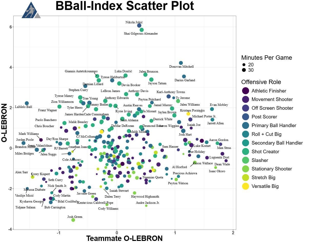
The y axis is player’s individual O-LEBRON (their approximated offensive impact) and x axis is their teammate O-LEBRON (the approximated offensive impact of their teammates when on court)
Who stands out?

The y axis is player’s individual O-LEBRON (their approximated offensive impact) and x axis is their teammate O-LEBRON (the approximated offensive impact of their teammates when on court)
Who stands out?
4 comments
https://preview.redd.it/p55j07qgixme1.jpeg?width=1200&format=pjpg&auto=webp&s=4fa4b1f1781f9e22383a8cea43baa15c18929379
Full image here.
TL;DR our guys are all on the very far left meaning we have a team full of the lowest approximated O-LEBRON, or offensive impact. This tracks with our team’s 29th best ORTG.
Josh Green has the lowest O-LEBRON of any qualifying player in the entire NBA
LaMelo Ball still has very good (90th percentile) O-LEBRON despite this.
I understand that the “LEBRON” metric is just a funny acronym but still I wish the statistic used LeBron James as the barometer. Like I want to open up a LEBRON chart and see LeBron James at 1.00 LEBRONs every time lol
Them classifying Josh as a “stationary shooter is pretty misleading” since he never hits his shots im pretty sure they should change it to “stationary”
That being said I don’t put much into these charts (or analytics as a whole since they fobt paint a full picture) because Moose is basically the worst of the worst but anyone who watches understands what he could be for rebounding and defense when he’s let loose.
Look at Lamelo man, so inspirational and upsetting