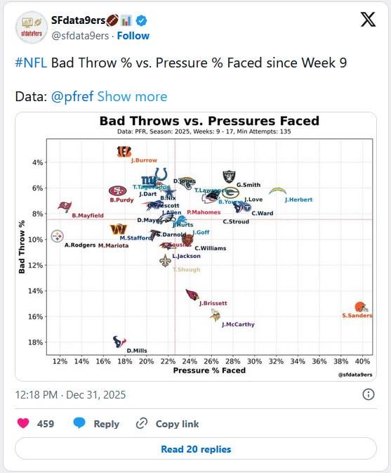
Guys, is this good? Bad Throws vs. Pressures Faced
January 1, 2026
Guys, is this good? Bad Throws vs. Pressures Faced
17 comments
Is Geno good??
What is considered a “bad throw”? It feels like a really subjective data point.
If a chart has Matt Stafford and Marcus Mariota overlapping then the X and Y axes probably have an R=0 or somewhere close. i.e. I learn very little from this.
Edit: Well and the fact there’s no obvious trend by looking at the whole thing
It’s saying Shough is facing about average pressure while making slightly higher % of bad throws than average.
Now who is judging what’s a bad throw or not? Hmmmm. I also want to know what the metric is for pressure that Sanders is seeing nearly 33% higher pressure (~40% of throws compared to ~30% or less for everyone else).
One of the good things is that as the season has progressed, Shough has gotten better under pressure almost in a linear fashion if you exclude the Jets game where he was apparently dealing with injury and seemed kinda off despite the 300+ yards and 0 ints
Yes but seems like it’s totally subjective. Both pressures and throws
I think there are too many variables to say this is significant. They all play mostly different schedules, have different olines or see different pass rushes, one game the pass rush or oline can be unstoppable the next they can’t get anything done right.
If you take the numbers at face value it’s not *good* but also he’s a rookie
It’s another example of jamming data into a plotter to make it say what someone wants to say. It’s subjective and therefore meaningless as a data set.
What are they considering a bad throw? An incompletion?
Geno Smith is near the top of fewest bad throws? You can throw this chart away.
There were so many Geno plays where he’s throwing to a section of the field, not at a receiver. Heck, they fired his OC because of how badly they were doing.
notice how much of an outlier Sheduer is XD
It’s a fake statistic. It would only make sense if the throws were headed individually this way.
In this graph, the bad throws aren’t necessarily the same plays as the pressures counted.
Holy shit I am tired of these weird nonsense stats to either say Shough is good or not good. Just watch him play football if you want to know if he’s good or not.
A lot of people are asking what a bad throw is, I’m gonna ask how do you truly determine pressure rate. A team that has a horrible oline but a decent play caller might call more of a short passing game making the pressure rate lower despite below average offensive line play.
This. This is dumb.
Eyeballing it, this chart seems to suggest that there’s not actually a strong relationship between the two variables?
What’s the R value?