I keep hearing two pronunciations for his name Robert or Ro-Bert?
Maybe hot take but personally I am a fan of the 2026 graphics design
Mets World Series Champions 2026
His physical must have passed real quick!
If Robert can post a . 700 OPS with some pop and elite defense this is a great move. That’s “only” 40 points better and nowhere close to what he was in ’23.
Even if he misses time, Mets are still deep enough to thrive without him.
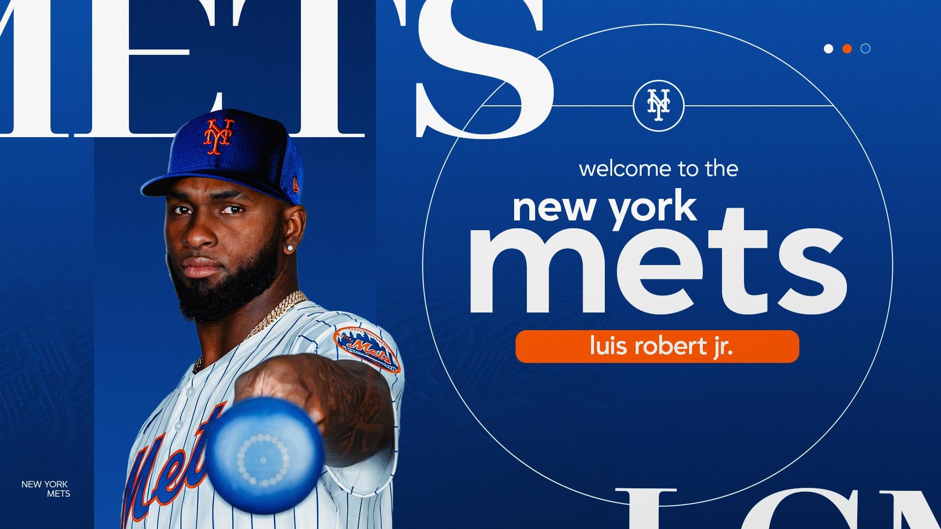
Tangential, but, how do we feel about this lower-case text brand package? It’s giving me insurance company vibes and I can’t say I like it. Reading “new york mets” in lower-case just feels wrong.

10 comments
I keep hearing two pronunciations for his name Robert or Ro-Bert?
Maybe hot take but personally I am a fan of the 2026 graphics design
Mets World Series Champions 2026
His physical must have passed real quick!
If Robert can post a . 700 OPS with some pop and elite defense this is a great move. That’s “only” 40 points better and nowhere close to what he was in ’23.
Even if he misses time, Mets are still deep enough to thrive without him.
Tangential, but, how do we feel about this lower-case text brand package? It’s giving me insurance company vibes and I can’t say I like it. Reading “new york mets” in lower-case just feels wrong.
wow that was fast!
This graphics package is really meh.
What are these fonts?
Lmao
Looking nice in orange and blue 🔥