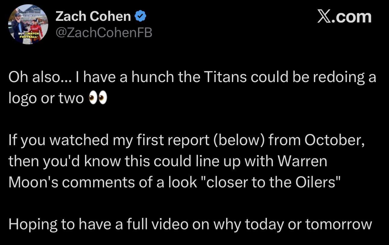
The NFL uniform guy (Zach Cohen) says there’s a possibility the Titans make changes to their logos as well this season

The NFL uniform guy (Zach Cohen) says there’s a possibility the Titans make changes to their logos as well this season
31 comments
I was literally saying to my wife the other day that it’s wild we still have Gastly as our logo
While the timing is odd, I welcome these changes. I’ve felt the logo could use an update for maybe the past decade at this point.
It could happen but there’s a lot of “trust me bro” in his videos. I’ll wait for the official announcement before getting excited.
Hell, might as well. New coaching staff, new qb, new stadium. Might as well take it all the way
You can pry my flaming thumbtack from my cold, dead hands.
I just hope that it’s well received. I remember being a little underwhelmed by our newest ones and pretty much immediately missed the white helmets
I personally have always loved our logo. I’d be okay going with a sword type logo as primary though
Vikings fan here, I come in peace. I like the Titans logo and color scheme. I think your previous uniforms were better though. Anyways, good luck next year.
Oilers rebrand? They’ve already done test runs that we’re well received
I will say, one of the re-designs posted here had a vertical sword that integrated the Oilers derrick design into the blade which seemed VERY close to what we might actually get imo
As long as we dont to some web 2.0 corporate looking logo like the Rams im good.
Houston Texans fans will collectively lose their minds and have a mental break if we reference anything to the Oilers in our new uniforms 😂
I’m here for it.
Pls god
I may be a minority but I cant say I give a fuck about the Oilers at all.
Trolling Texans fans is its only use to me.
Id probably feel a type of way if we forget we are the Titans and shift back to Oilers.
I’m fine with new uni’s but honestly I’ve done a 360 on our logo. I LOVED it when I got into the team, went into a phase where I hated it. Now I love it again. Maybe that’s just nostalgia for the hope I had picking this team 😂 idk. But the flaming thumbtack IS the Titans to me. It’s like a pride thing at this point lol. Just please don’t let it be worse if they do change it.
I just wanna know how many of the Oilers faithful are under the age of 40
Three stars in a circle like the state flag and nothing else on the helmet. No sword, no flame. Simple and tough.
That it just make those red facemask uniforms the real uniform. That is one of the best ever IMO
Knowing Amy Adams Skunk, she said “ditch the logo, keep the uniform colors.”
Good, it’s time to update that logo. Feels very dated as this point
Drop the flames, the tristar is all we need!
I think a lot of our current look was optimized for marketing and the sort of “telling a story” design that made for some atrocious visuals through the 2010s.
I’m hopeful we’re going to go for designs that are visual first and use more versatile things like the Oilers palette to tell our story this time.
Good. Our logo is so dated and looks off its era. It’s the most 1990s logo of all time
A proper Oilers homage but still Greek titans

They’ll potentially be putting new branding on everything associated with new stadium so will need to get it out there before it’s leaked
Good I’m done with the flaming thumbtack
I will always be a flaming thumb tack. Til I die yo
We need that red alternate jersey
I personally think everything is getting a refresh besides the name of the team and T-Rac.
I also think we will drop Navy down to the 4th alternate color and promote red back up making it as matter of face oiler colors.
I love how torn our fan base is on the logo lol
Fingers crossed it’s the Texans logo with Houston oiler colors
Oiler jerseys with sword logo.