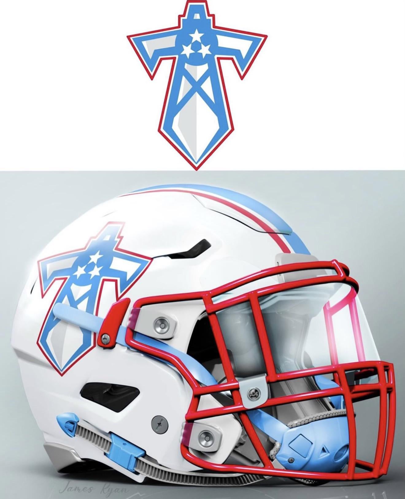
Last summer I made this design which received a lot of attention. Some loved it. Some hated it. Let’s run it back.

Last summer I made this design which received a lot of attention. Some loved it. Some hated it. Let’s run it back.
31 comments
I love it
Smash

Big fan. Would be thrilled if this was the helmet.
this is one of the cleaner ones i have seen, but i don’t think our branding should have anything at all to do with the oil derrick. the throwback oilers logo on its own is a cool piece of history, but idk about trying to retroactively reintegrate it into the brand when there’s nothing oil-related in nashville.
You got my vote
Whatever upsets Houston’s fans the most
thats sick man good job. now send to Amy and tell her she can have it lol

I’m in
Yes
We are not the oilers. There is no reason to use the oil derrick in the logo.
Other than that, I like it. I wish they would use the red face masks for sure.
r/tristarfails
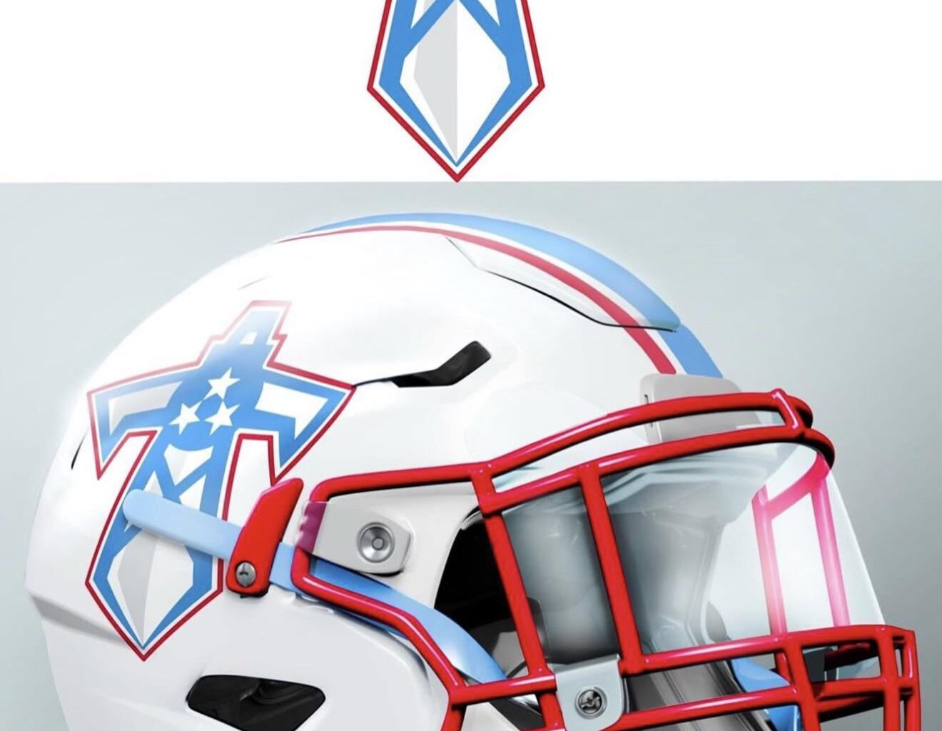
I feel like the sword should be the darker blue so it’s less washed out against the white.
Other than that I dig it.

It would be good for a cool throwback uniform but I don’t think I’d like it for the regular logo.
This is the way. The sword should have been the logo from the beginning
And I’m once again reminding you the tristars are upside down. Please do not insult Tennessee heritage with this.
https://preview.redd.it/iubfk23y6xeg1.jpeg?width=224&format=pjpg&auto=webp&s=11dc46adf87fb2a3fefc61a9055ca7e598f20389
Fix the tristar and I’m in
So much better than the logo that is literally going down in flames.
Much better!

nope
In the same way our current kit needs a splash of red, this would really hit with a little bit of dark blue around some of the borders
Would love to see this helmet with the old Oilers jerseys, kind of like what the Commanders are starting to do with the old Redskins jerseys.
This is clean…let’s see what the jersey would look like in this theme
Typically I’m very anti anything fan made because it’s always shit.
I don’t hate this one.

This genuinely fire. If we are going to change the logo, this is the perfect blend of old and new
I love this concept.
I would like to see the sword with and without the tri star to compare.
As alternates:
I would also like to see the sword logo on one side of the helmet and just the tri star on the other.
Also I think you could use the sword as the center stripe and put two tri stars on the sides.
In any case, I would love to move past the flaming thumbtack and this is a great way to do it.
Peak
