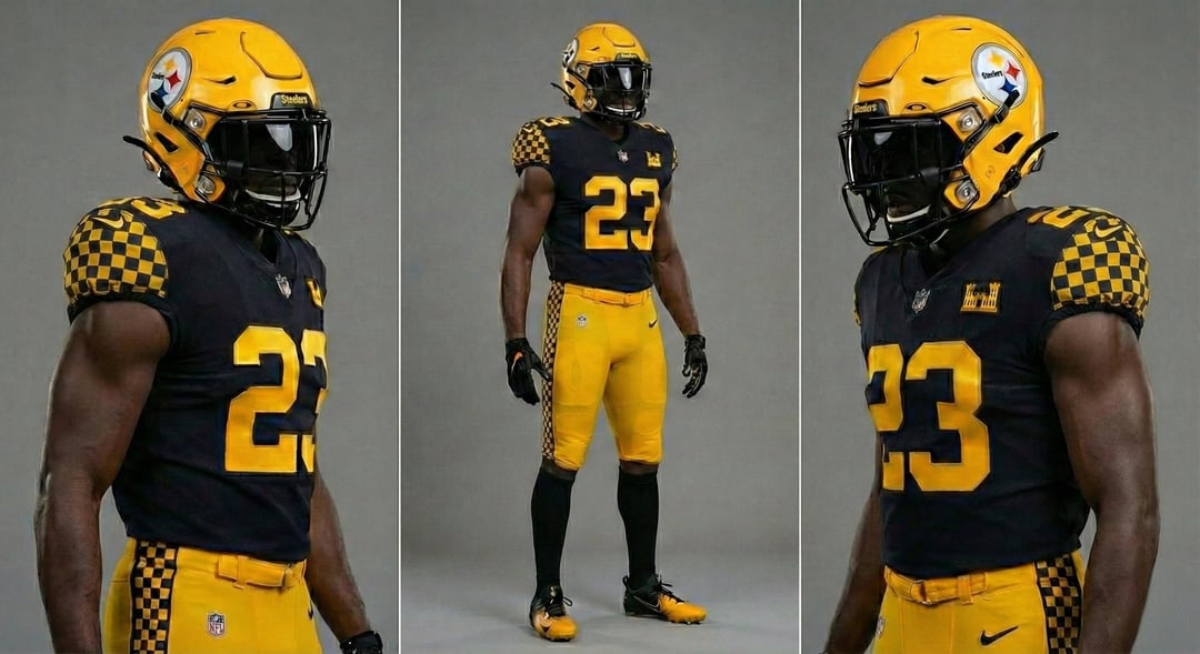
Since y'all hated the idea of adding the logo colors to the uniform, how would you feel about the organization incorporating the Pittsburgh city seal into a future 1 game alternate instead?

Since y'all hated the idea of adding the logo colors to the uniform, how would you feel about the organization incorporating the Pittsburgh city seal into a future 1 game alternate instead?
32 comments
Looks too much like a college team.
Not feeling the checkers pattern, but I applaud the outside the box idea.
These are awesome! Really love it with the white numbers

These are not the worst uniforms I’ve seen. If I’m being honest they look a hell of a lot better than the alternatives we had this year.
But why’s everyone always trying to fuck with our unis?.. it’s been unanimously decided, we want the regular uniforms not fucked with, everyone wants block letters back.. and for our alts you have everyone asking for the bumble bees, or second place everyone wants the alt uniforms from 2008(my personal fav over the bees). Yet it seems like there’s a small group of fans that have made it their life mission to come up with a different uniform for the Steelers that the fans will accept. I don’t get it.
gross, looks like a race flag.
Looks too contemporary for a classic game and a classic team
I like the ones with the white numbers a lot!! Good job. I do think I’d like them even more without the checkers
Edit: just to add they would also look awesome with white numbers and white pants.
1st set would make a good alt, definitely add the city seal. I think its the white numbers that make the 2nd set look bad to me
Gotta say HATE these, it’s the checker patterns for sure.
Haden and Schuster are back baby
Honestly I’m ready for a revamped home uniform. With change comes change.
Mmm… aahhh…..
Wouldn’t call it “great.”
Throw a bit of red in there and it kinda looks like Maryland unis.
I wanna see some gray/steel and more gold than yellow. Wish we could lean a little more rugged.
❤️
NYC cab?
These are sweet I like these a lot
The checkers are way too maryland flag adjacent
https://preview.redd.it/dytgb4gez7fg1.jpeg?width=588&format=pjpg&auto=webp&s=75ac0c5af05147e07b8d45f071e6b32127f79810
An abomination
I hate hate hate gold helmets. Black with the aisi logo and a gold accent only please
The checkerboard on the seal is Bavarian blue and white though. It looks like a taxi in black and yellow.
Also not a fan of the yellow helmet.
Maybe do a like a steel diamond pattern down the black stripe on the pants would be kind of cool too
I’m now mad we don’t use a black and gold checker design anywhere. And I still dig the hypocycloid colors on the helmet stripe. I’m assuming I was one of a small few?
No
You know I don’t hate it
Has potential. It might be best as helmet and jersey from 1 with pants from 2.
I really like the first one. Really good.
I honestly really like this idea, I’d probably stick with the primarily black helmet tho
Yes
Anything with the yellow helmet I’m in
I…..dont hate this, but, the helmet canNOT be matte, gotta have a normal amt of glossiness to it