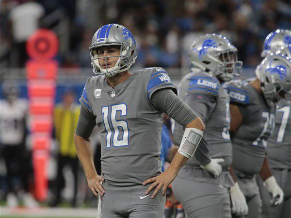
I hated these jerseys. The black ones are a million times better
April 19, 2026
I hated these jerseys. The black ones are a million times better
23 comments
I don’t hate them, I think they’re alright. But they’re definitely not my favorite.
Atleast these are Lions colors.
I liked them just because they were unique. I don’t mind grey, but I’m guessing a few shades darker (or maybe even lighter) would have had more broad appeal.
They drive me nuts. Our “color rush” jerseys were gray, not silver gray. How much more disrespectful could Nike get. The blue helmets did enhance them a bit.
IM NOT ALONE
If they were silver I would’ve liked them more
Agreed
I know they need a variety to sell jerseys and hype people up, but I prefer to just stick with Honolulu blue, white and silver. Skip the grey and black options. Those aren’t our colors.
I always thought they kinda looked like pajamas.
These weren’t terrible
I just like it when they used to win the division, make playoffs etc
These are so much better than the black jerseys
Couldn’t agree more
I felt a similar way about the Tigers’ City Connect jerseys. I totally get wanting to embody the “Motor City” but could we get some more colorful and creative options every now and then? The Pistons have had a few good alternates in recent years, like the ‘22 City Edition.
For the Lions, I get that silver doesn’t really work on a full uniform, but I’m hoping our upcoming Rivalry uniforms use blue as the primary color for once, or go in a totally new direction just for fun.
People either loved them or hated them. Or thought they were all right.
Black and blue baby detroit what DETROIT WHAT lets see some fucking kneecaps baby DETROIT WHAT
I would have liked the set a lot more if the pants had some detailing on them of some sort
Disagree. The black is generic and has a middle school sensibility of “cool” to them. These grays at least had an identity. Similar to the Rams bone jersey.
They’d go harder if they made the numbers a shiny honalulu blue with white outlines. Don’t puke, but the Buckeyes did this with their alts on year and it very clearly is a wildly good look.
If they did this, with an inverted helmet of blue and shiny silver Lion, it’d be even better.
I’ve always loved these, but I can see why you say the black ones are better, the blue pops more on the black
Gray was not the way
They remind me of the “football” jerseys in Starship Troopers
Agreed. Now let’s convince them to start wearing their Honolulu blues with the silver pants this year.

23 comments
I don’t hate them, I think they’re alright. But they’re definitely not my favorite.
Atleast these are Lions colors.
I liked them just because they were unique. I don’t mind grey, but I’m guessing a few shades darker (or maybe even lighter) would have had more broad appeal.
They drive me nuts. Our “color rush” jerseys were gray, not silver gray. How much more disrespectful could Nike get. The blue helmets did enhance them a bit.
IM NOT ALONE
If they were silver I would’ve liked them more
Agreed
I know they need a variety to sell jerseys and hype people up, but I prefer to just stick with Honolulu blue, white and silver. Skip the grey and black options. Those aren’t our colors.
I always thought they kinda looked like pajamas.
These weren’t terrible
I just like it when they used to win the division, make playoffs etc
These are so much better than the black jerseys
Couldn’t agree more
I felt a similar way about the Tigers’ City Connect jerseys. I totally get wanting to embody the “Motor City” but could we get some more colorful and creative options every now and then? The Pistons have had a few good alternates in recent years, like the ‘22 City Edition.
For the Lions, I get that silver doesn’t really work on a full uniform, but I’m hoping our upcoming Rivalry uniforms use blue as the primary color for once, or go in a totally new direction just for fun.
People either loved them or hated them. Or thought they were all right.
https://preview.redd.it/ym116l41s6wg1.jpeg?width=1000&format=pjpg&auto=webp&s=100e550e0caa8f554cc2613f1c35e3667adcbd00
Black and blue baby detroit what DETROIT WHAT lets see some fucking kneecaps baby DETROIT WHAT
I would have liked the set a lot more if the pants had some detailing on them of some sort
Disagree. The black is generic and has a middle school sensibility of “cool” to them. These grays at least had an identity. Similar to the Rams bone jersey.
They’d go harder if they made the numbers a shiny honalulu blue with white outlines. Don’t puke, but the Buckeyes did this with their alts on year and it very clearly is a wildly good look.
If they did this, with an inverted helmet of blue and shiny silver Lion, it’d be even better.
I’ve always loved these, but I can see why you say the black ones are better, the blue pops more on the black
Gray was not the way
They remind me of the “football” jerseys in Starship Troopers
Agreed. Now let’s convince them to start wearing their Honolulu blues with the silver pants this year.
I loved these, to each their own though
Comments are closed.