
— Previous article
i literally just found this next to my bed, any clue who's signature it is?
Next article —
Mildly Interesting: My son met George McCaskey at the Atlanta game. George gave him this coin. (quarter for scale)
You May Also Like
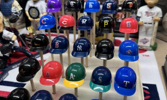
Old MLB plastic helemets.
Found a bag of my old helmets, cups, balls, all that from retail store vending machines as a…
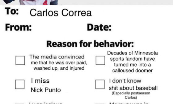
I had to fill one of these out after the last few games
I’m sorry for any bad thing I ever said about you Carlos.
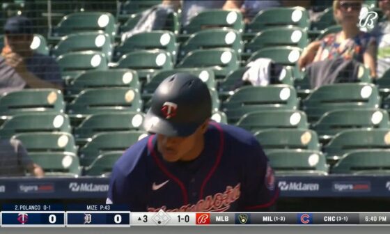
Throwback to Dick Bremer being indignant about Justin Morneau’s parenting decisions.
Throwback to Dick Bremer being indignant about Justin Morneau’s parenting decisions.
17 comments
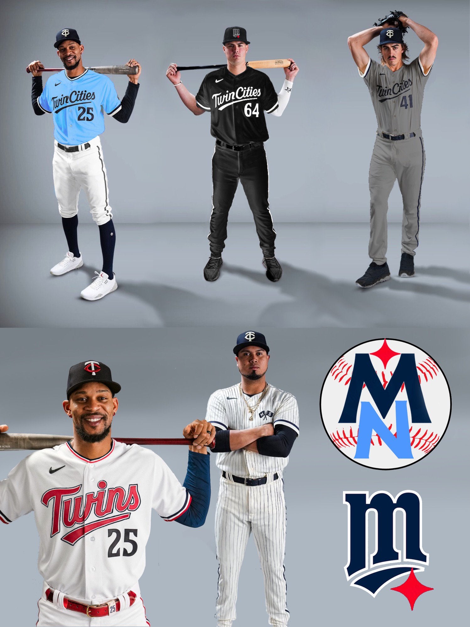
Every other day I have to sit for IV infusions for a few hours and doing these help pass the time. I was never a huge fan of the M logo, but adding the North Star to it still feels a lot better than the new one.
I’m a fan of the powder blue one. Also like where you’re going with the pinstripe concept. Would want to see the flags logo about 2-3x as big though.
I’m digging the old “M” with the North Star. Would be curious to see what it looks like though with the star moved to the upper left-hand of the “M,” resting just in front of (or maybe even behind” the serif of the “M.”
Can’t stand when teams have black jerseys and its not in their color scheme. No thanks.
Don’t like any of these, we must have very different tastes. Ive been pondering if the MN would be a nice cap look, although I was thinking horizontal orientation rather than vertical.
These make me appreciate the new jerseys more, so thank you
Hell yes on that M hat.
Can you get a job there, please? These are slick. Love the M logo and the North Star.
I’d love to see the real Twin Cities set with just a hint of red tbh.
I’m sorry a couple of these remind me of the White Sox uniforms 😬
Can someone start a petition we can all sign and send to the Twins telling them how terrible the new M is? Not that they’ll care either way…
Black Uni is fly
MN with the baseball is SOOOOO much better.
missed opportunity for “the more you know” logo.
Black ones remind me of south side 🤮
I’ve never liked pants that are anything besides white or gray. They look too much like softball uniforms
I actually can sorta see why they went with the un-outlined team name – at this weight, the logo looks unbalanced with an outline, thick and indistinct.