

— Previous article
[Faber] “We’re sick of not making playoffs. This sucks coming here every year and being in this time span. There’s not much else to say other than we’ve got to build the culture the right way and work to get better.” -Brock Boeser showing some passion about building a culture
Next article —
[Narsu] Maxey should take like 10 3s a game. Even if it's not 10, the current 6.2 /game (or 6.6 p36) is definitely not high enough. Over the last 2 years, he's shooting 39.7% on 297 pull up 3s & 45.3% (!!) on 373 catch & shoot 3s.
You May Also Like
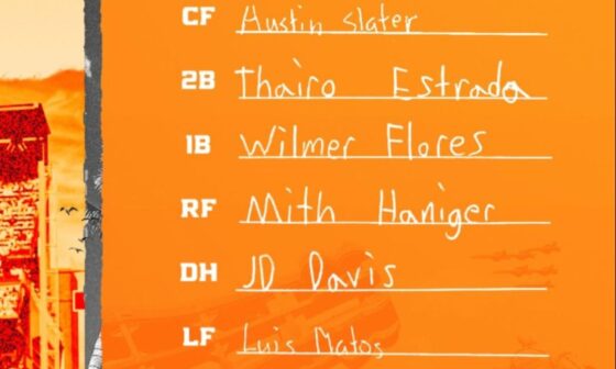
9/8/23 Lineup Card
Written by children undergoing treatment for pediatric cancer.
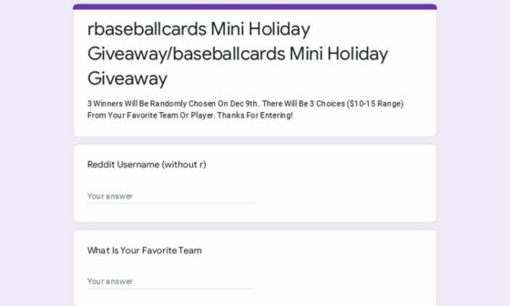
Enjoy Baseball Cards Of Your Favorite Team? Join My Giveaway Here
Enjoy Baseball Cards Of Your Favorite Team? Join My Giveaway Here
Giants reportedly scouting Hsiao Chi, who already throws 93.9 mph at 17 years old
Giants reportedly scouting Hsiao Chi, who already throws 93.9 mph at 17 years old 17-year-old 蕭齊 (Hsiao Chi)…
9 comments
If you don’t want to click through, the hat says “San Fransico” above the SF logo. Classic.
lol
Aaaand it’s already sold out. Rats 🙁
I mean, it’s on you if you buy that monstrosity of a hat
Looks like they’d sell that hat as a knockoff at a BART station. Ugly design regardless of the spelling error.
They probably realized that the only way people would ever wear that ugly hat was if they made a spelling mistake to make it “unique”
it reads like “San Fran-Sy-ko” to me. wasn’t there a time that moniker was floating around? Mistake for sure, not an unmarketable one.
The Moises Alou Bobbleheads with “GAINTS” on his jersey didn’t become collectors items
Just embarrassments.
At first I thought it was on purpose since it’s supposedly an Old English hat, and I thought that maybe that’s how Francisco was spelt in Old English lmao