
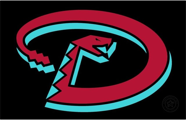
Here’s a mock up of what the old “D” would have looked like in the new color scheme along side the new “D” for all the nerds like me who care.
Personally I would have loved them to have kept “sand” or darkened it to gold/copper & used it as a secondary accent color like ‘98-‘06 instead of going red/teal(turquoise)/black, but that maybe a Nike/Fanatics cheapification decision to save on thread💰

2 comments
https://preview.redd.it/2ukheakmfujc1.jpeg?width=300&format=pjpg&auto=webp&s=7487d8a6937e6a5ed6642455fe6cdf8b96bae5f0
Of note about too many colors on 1 logo – the original copper “D” was actually 5 toned; the copper snake, purple lower highlight, lighter purple upper highlight, black outline, teal diamond pattern.
Interesting that they removed the drop shadow. I think the designers did a really good job at bringing the logo back in our new colors. I’d prefer our purple scheme but this looks great too.
I do think that the new one is better for our new colors. The outline really makes it pop. It also matches a bit better to the A logo so it’s easily recognizable to our team’s identity.