
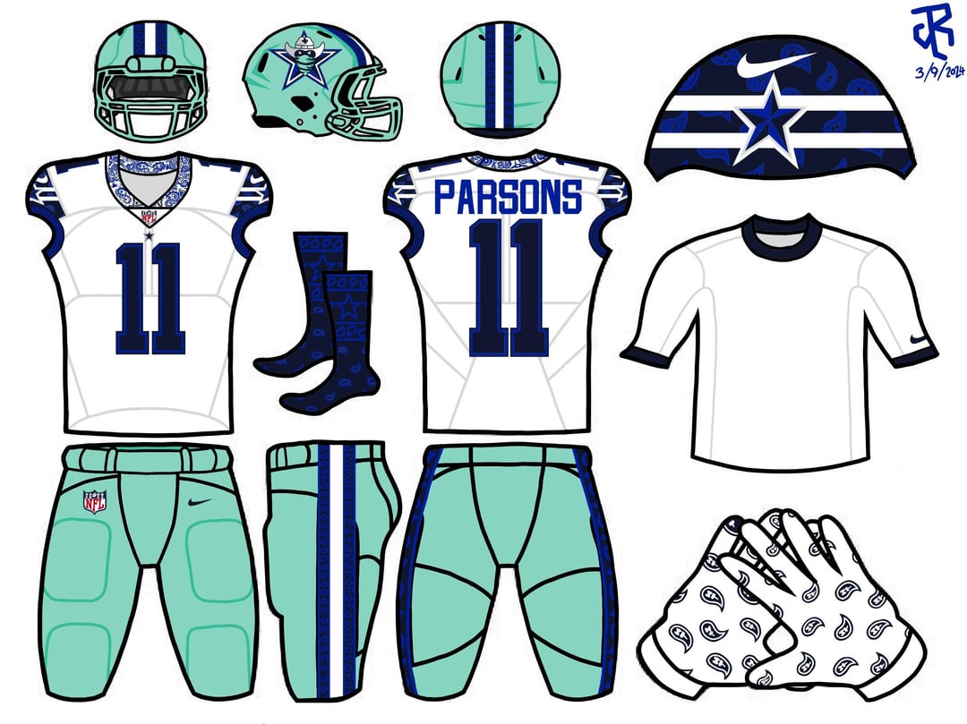
I decided to try my hand at rebranding the Cowboys. I’m aware that their current uniforms are iconic and classic to some, but I aimed to add some more western flair to live it up to the “Cowboys” moniker a little more. Not to mention, if I’m being honest, the mismatched helmet and pants have also kinda pissed me off. I hope y’all fucks with them
19 comments
They will never change the Star ever.
The seafoam green helmets is wild lol
That helmet is a MAJOR nope. Way too much going on. Star, “cowboy(?)”, paisley…
Now throw it away
My brother in Christ, they already call us the Cowgirls.
Oh my God no – less space blue, not more.
I want to give constructive criticism, but…just no. The logo change alone.
WTF no, what is that shit color?
Lame ass logo
Seafoam green helmets are hideous. Seafoam green pants are great. Also what the fuck is that blue “Hooker” one. Also also, you don’t fuck with the star, it is iconic, don’t add shit in the middle of it. Also, also, also, that “face” isn’t a “Cowboy” face, that is a “Bandit” face. Cowboys don’t put dark around their eyes and have a bandana covering their mouth unless it is specifically dusty, you are sending the wrong message there.
Nope. Nope. NOPE!
The seafoam green unis are cursed my friend
This is exactly why they don’t need a rebrand.
Next turn McDonald’s arches blue, Coca-Cola purple, and Nike Swoosh into an X.
we have one of the best unis in the league
Thanks for doing this to show them that they shouldn’t.
Always cool to see someone take something in another direction, so good job trying something new.
With that being said, I don’t think you could have designed a worse alternate uniform. Changing the star is one thing, but adding a cross eyed bandit?? Then all the color changes? One uniform looks like a Lions alternate, and the next looks like it was designed by an Eagles fan to give us shit.
Nice try but these aren’t the uniforms you’re looking for
Try your hand at not rebranding the cowboys…
My guy tryna turn em into the Dallas Cripboys 😂
Delete