
— Previous article
Can someone help me understand what the global market program is and why the Browns are only in Nigeria?
Next article —
Custom jerseys
You May Also Like
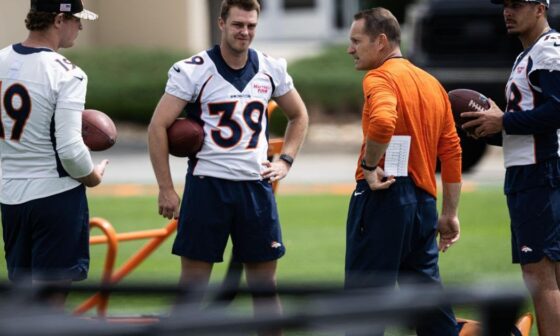
Ben Kotwica brings wisdom to Broncos as former Army captain, longtime special teams coach
Ben Kotwica brings wisdom to Broncos as former Army captain, longtime special teams coach

J.J. McCarthy Talks NFL Draft Prep, Interviews, Sherrone Moore, Michigan At NFL Combine I #GoBlue
J.J. McCarthy Talks NFL Draft Prep, Interviews, Sherrone Moore, Michigan At NFL Combine I #GoBlue
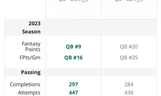
Based on stats, overall W/L record, and chances of making the playoffs in 2023, which QB/contract are you taking?
*Geno missed week 14 due to a groin injury sustained in practice. Seahawks are on track to make…
41 comments
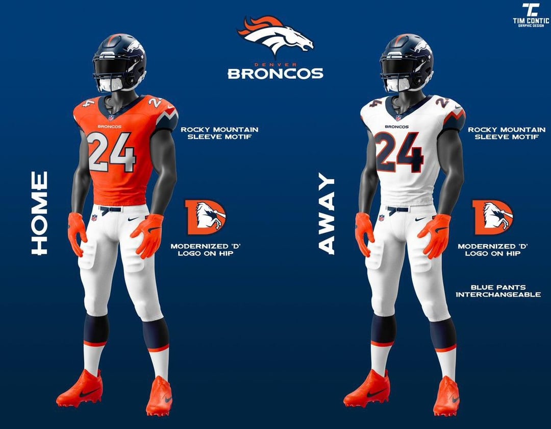
It’s not the worst version of this concept that I’ve seen, but it’s not the best
nah – we’re going to white helmets
Ehhhh I doubt we use the same font
“Complete redesign”
I just hope the mountains are more subtle.
This looks like a refresh and not a complete redesign. Based on the comments it’s going to be more pronounced than this.
Like one of y’all said earlier in the comments, i’ll hate them when i first see them and i’ll like them by week 6.
If this is it I’d be disappointed. These are almost identical to current uniforms (yes, side stripe is gone, mountains on the shoulders, etc.). Kinda hoping for drastic changes.
Don’t bother.
This is gonna be so underwhelming that I don’t even care anymore lol.
“color rush”
Completely white
Just kinda boring.
Looks about the same
nothing will 90% of this sub happy honestly
I am whelmed
The Color Rush being all white is hilarious
Boring
I will stand by that the Denver blues are our best looking uniform. Also love the mountains on the sleeves.
Fuck it, Coors Light
I might be one of the few people that really likes having something on the side of our pants. I think it adds to our uniqueness. Hate to lose that
If this is it why bother?
> modernized ‘D’ logo on hip
I appreciate that it’s so visible in these renderings…
Regardless of what they are they’re going to be associated with losing brutally, cursed no matter what
This is fine. Mountains are ‘eh’, but whatever. If I have to take a mountain silhouette on the sleeve to finally lose the fucking side stripes, I’ll take it.
Although the shade of orange and blue do look slightly different in the tease. Orange seems brighter, blue seems more steel.
Why can’t we just have Navy Primaries anymore mannnn!
I would like to see what it would look like with the base part of the sleeve matching the main color, and the only highlight being the line for the mountain. If they don’t subtly like that, it could look good.
I love how everyone commenting on these like they’re the official uniforms lol. We have no real idea of what they will be apart from mock ups and descriptions
I hate the all white color rush. Makes me think of the cowboys
isn’t this missing the new “Icy Blue” they talked about in the uniwatch article? iirc it’s going to be an outline for the numbers and for the mountains
I’d be OK with these uniforms, mostly because I don’t like the idea of a white helmet full time.
The helmet and number font is what can make or break a uniform. Hopefully they do it well.
Yup…that’s a uniform
I like the sleeves but this would be disappointing if that’s all they changed.
Those are XFL level. Yikes.
Cool so we’re an Arena Football team now?
Broncos Country, “Let’s Cry.”
The mountains need to be blue so we know when they’re cold.
I like the mountain sleeves ngl
They didn’t need to announce these. There is nothing new here except the mountain McDonalds sleeves.
The all-white is alright/good but meh to the rest.
IMO go hard on orange and possibly drop the horse head logo (maybe fully embrace Blucifer?).
How hard is it for them to just give us the fucking D man? It’s that easy.
Getting rid of the pointy stripes is a win in my book. I’d love to go back to the “D” because it’s nostalgic and I’m personally over the flying head logos that took our world by storm, like us, the patriots, jags, panthers, eagles, ravens, etc.
As an outsider, this is looks more of a refresh. However, I think it’s a big improvement. Though I don’t hate the shoulder mountains, I think a single of double stripe would have been better.