
You May Also Like
![[Schwager] The #Texans ruled out LT Laremy Tunsil, backup LT Josh Jones, LB Denzel Perryman and DB Tavierre Thomas. Stroud is now down to his third LT.](https://www.rawchili.com/wp-content/uploads/2023/09/uLoF789MKbVNEfG0SxtYdyys20xGEp28T5WcmG3P4GY.jpg)
[Schwager] The #Texans ruled out LT Laremy Tunsil, backup LT Josh Jones, LB Denzel Perryman and DB Tavierre Thomas. Stroud is now down to his third LT.
[Schwager] The #Texans ruled out LT Laremy Tunsil, backup LT Josh Jones, LB Denzel Perryman and DB Tavierre…
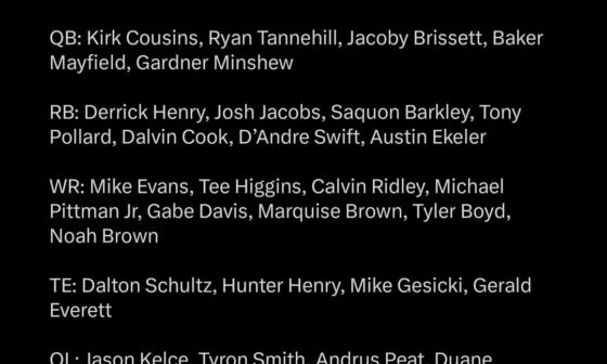
For the 2024 free agent class, who is someone we should attempt to sign.
Personally, I would love to try and get Mike evans.
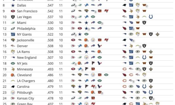
Teams ranked by remaining strength of schedule with opponents over and under .500 listed
Teams ranked by remaining strength of schedule with opponents over and under .500 listed
5 comments
These are kinda cold I’m ngl 😮💨
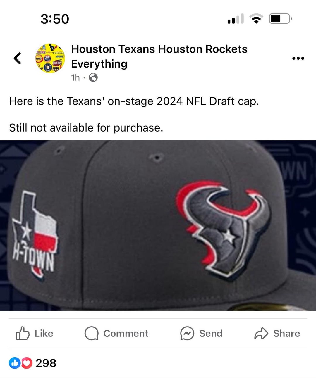
No blue backdrop 🤔 I’m a bit skeptical now, because even the Htown isn’t like OUR thing. It’s We Are Texans isn’t it? Either way pretty cool
Interesting that the red is not on the logo itself but as a background effect instead. Doesn’t look like steel blue either. I feel like this design is intentional to avoid any references to the new unis.
These are pretty nice!
These are just draft caps and not a change to the logo, right?
I’m in the camp of hoping they keep the logo the same. I think they pretty much nailed it the first time, and I would have no problem being one of those teams that keeps the same logo forever.