
— Previous article
Why Xander
Next article —
Exit interview MegaThread: Coach Keefe and most of the Wizards Players
You May Also Like
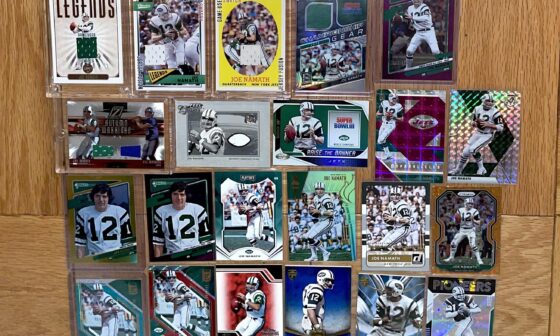
My Joe Namath current card collection 🐐🏈
My Joe Namath current card collection 🐐🏈
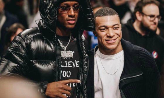
The Best Young Football Player on the Planet Pictured with Kylian Mbappe
The Best Young Football Player on the Planet Pictured with Kylian Mbappe

“We can’t have Flacco or Wilson start if Mike White can’t play, what are we going to do!?”
“We can’t have Flacco or Wilson start if Mike White can’t play, what are we going to do!?”
21 comments
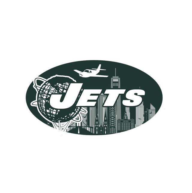
To be clear, I’m not arguing for this to BE the logo. I just always wanted to actually make a logo for a sports team. I’ve always been a fan of the Parcells/Namath era logo but I wanted to do something more interesting than just the NY in the background. I love when the logo connects more with the city than the mascot so you have the World’s Fair globe to highlight where we came from, the skyline to highlight where we are, and the plane soaring above it all to highlight where we can go.
These fucking suck. Tell me you know nothing about logo design without telling me you know nothing about logo design. Don’t quit your day job, unless your day job is design, then please quit it immediately.
Don’t think I’ll ever be comfortable seeing a plane and skyline together in a logo
Not trying to be rude, but these ain’t it. I appreciate the attempt.
A plane flying with a NYC tower nearby is, simply put, a God awful idea.
As illustrations these are cool…as logos, not so much. All of them are way too busy (too much going on visually). Gotta remember sports logos need to look as good blown up on a poster as they do shrunken down and placed on a jersey.
4 but Scarface vibes on 3 1 is cool tho
There’s not a single jet in any of these.
Is that a prop plane used for a logo of a team called the Jets?
They’re fine for a t shirt but not an official logo
I really like the first one
I prefer the 1st one, but I would have rather seen a fighter jet as the plane instead of a weak little Cesena
As a Queens native, I appreciate the Flushing Meadows globe Sculpture in there! 🙌🏼 also an homage to the Jets playing in Queens for almost 2 decades ❤️ I would get a T-shirt with this logo on it, well done
The jets don’t play in queens and haven’t in a very very very very very very very long time.
I dont like any of them. Too busy
The last one is really nice
Mfkr used a Cessna as jet.
I appreciate the effort, but these are terrible
Only note I have is the plane in the logo is a prop plane not a jet
I appreciate the effort and ideas. No, thank you
4 and it’s not even close. Agree with some of the other comments on 1&2. Worlds fair is cool but…so out dated.