
— Previous article
who on the twins would you add to this picture if they made it a real thing?
Next article —
Mock draft Monday
You May Also Like
One of the alternative candidates from VJ
Going to edit this to avoid confusion. I don’t want him as an alternative I’m saying he was…
Mark Schlereth breaks down why Albert O didn’t make the team
Mark Schlereth breaks down why Albert O didn’t make the team There is more to making a football…
Is OddsShark drunk?
Is OddsShark drunk?
20 comments
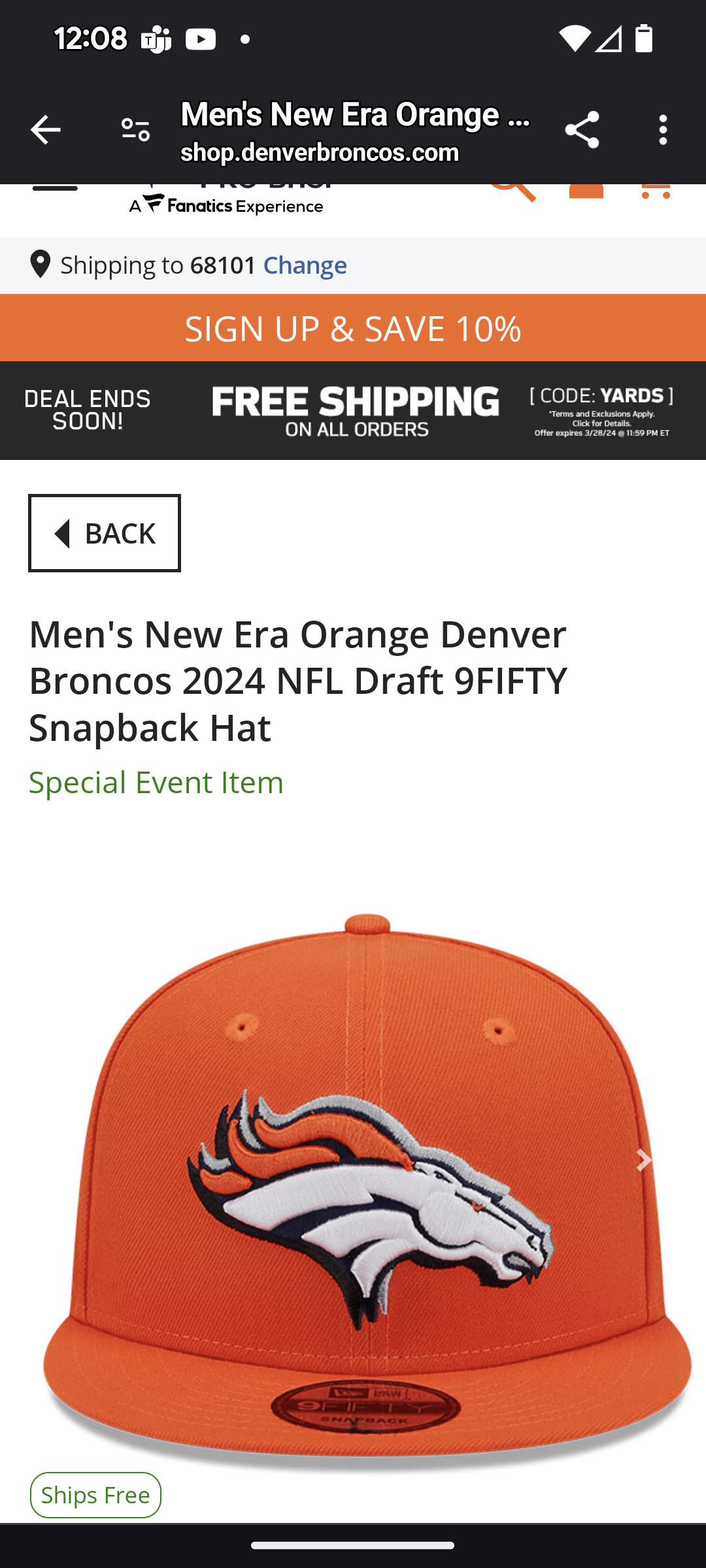
Not a logo tweak. Every team has a similar drop shadow
Those are a lot better than most draft caps
Each team’s hate has the outline of their respective states
It’s a cool idea for everyone who doesn’t live in a state that’s a rectangle
Grey bill, nope.
yikes
It looks like a 3D movie without wearing 3D glasses. Not for me. Makes my head hurt.
Way too much orange. It’s gaudy as hell.
The grey shadow thing looks really stupid, but I guess it’s better than the draft ones usually are.
It doesn’t even show the side which says “broncos county” with a shot of the Colorado flag in Broncos colors.
New Era trying to cover Fanatics’ ass by selling off-centered embroidery as a design choice
I got the black one lol
Why don’t we get a low profile fitted? Other teams have them up
It’s like they choose the worst/most boring designs on purpose.
Not only are we a poverty franchise, our merch is poverty looking
Sad face
…we gave him chubby cheeks?
Might be the best draft caps I’ve seen
Nah it’s just another fanatics experience
These are unusually conservative for draft caps. Usually the season goes something like
Draft- wacky
Round 1-7 – slightly less wacky
Round 8-12 – military, pink, my cause wackiness
Round 13-18 – plain logo standard hat.
Gonna look lovely on Bo McPenix
We haven’t given away our draft caps to another team?